Andy Warhol Explained the Swift Wedding Sixty Years Before It Happened
The wedding didn't become a business story for the reason everyone assumed
Taylor Swift and Travis Kelce married at Madison Square Garden on July 3, and within days the coverage split cleanly into two lanes. One lane covered the guest list, the dress, the officiant (Adam Sandler), the brothers standing in as Man of Honor and Best Man. The other lane, led by Business Model Analyst, tried something more interesting: it read the wedding as a business operation, complete with a venue lease, a unionized labor force, a security budget, and a public-relations strategy.
That second read is worth taking seriously. It's also missing something a photographer trained in modern art history will spot immediately, because the mechanism this "business case study" is praising was diagnosed, named, and painted by an artist sixty years ago, using the face of another famous woman whose image outgrew her.
What the business coverage got right
Strip the celebrity gloss off the reporting and the numbers are genuinely instructive. Business Model Analyst put the venue itself at roughly a million dollars a night across setup, event, and strike, for a wedding of about 1,000 guests with a smaller rehearsal dinner the night before. Forbes had already reported that Madison Square Garden's union agreements, stagehands and riggers included, push labor costs well above what a non-union venue would charge, and that a celebrity-tier planner's fee alone could run past $5 million once the difficulty of the job was priced in.
CNN reported security estimates from law enforcement sources running from a confirmed floor in the low six figures to well over a million dollars, much of it funneled through the NYPD's Paid Detail Program, which bills private event organizers for off-duty officers plus a city fee. None of this is disputed. The invisible costs, labor, security, build-out, really did outweigh the visible ones. That part of the argument holds.
Where it gets interesting is the next move: the claim that the couple's $26 million donation to more than twenty organizations, announced in the days before the wedding, functioned as what Business Model Analyst called a "reputation strategy," one that dwarfed the estimated public policing cost by a ratio of roughly 26 to 1, and therefore "bought more goodwill than any single element inside the arena."
The 26-to-1 ratio, and where that idea actually comes from
Here's the sentence worth sitting with: the donation cost more than the wedding itself, and the business coverage treats that as proof the strategy worked. Twenty-six million against roughly one million in disputed public cost. The ratio is clean, it's citable, and it reads like an insight.
It isn't a new insight. It's a specific, nameable rhetorical device, and it has a history that predates this wedding by half a century.
In 1975, Andy Warhol published The Philosophy of Andy Warhol: From A to B and Back Again, built around his observation that America's consumer economy had a strange democratic quality: the president, a movie star, and an ordinary person could all buy the identical product off the same shelf. His example was Coca-Cola. His point, distilled to a phrase short enough to quote directly, was that no amount of money can get you a better Coke. The wealth gap didn't disappear, it got hidden inside a comparison that made the gap feel irrelevant.
Warhol wasn't offering a compliment to consumer capitalism when he said this. He was diagnosing how it disguised itself. He'd spent the prior decade at The Factory doing exactly that in paint: silkscreening Coke bottles, Campbell's soup cans, and, most relevant here, a single publicity photograph of a movie star, repeated across a canvas until the repetition itself became the subject. The technique wasn't neutral documentation of consumer culture. It was a satiric inversion of it, and critics of the period read it that way, even as Warhol's own public statements stayed coy about whether he meant it as praise or indictment.
The ratio move, put a large, generous-sounding number next to a small, uncomfortable one and let the comparison do the moral work, is the Coke bottle trick with dollars standing in for soda. It doesn't measure whether goodwill was actually created. It measures whether a comparison can be constructed that makes an enormous sum look responsible. Those are different things, and only one of them is provable.
The painting that makes this literal: Marilyn Diptych, 1962
Warhol's most famous example of this exact mechanism isn't the Coke bottle. It's Marilyn Monroe.
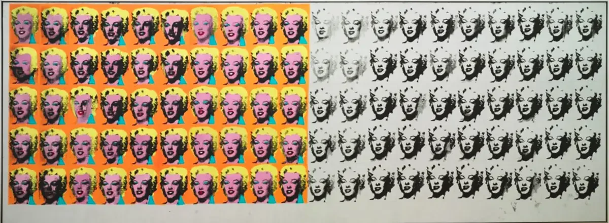
Weeks after Monroe's death in August 1962, Warhol took a single publicity still from the 1953 film Niagara and silkscreened it fifty times across two canvases, now known as Marilyn Diptych. The left panel is saturated in candy color: hot pink skin, yellow hair, turquoise eye shadow, the same glamorous face repeated row after row. The right panel is black and white, and the ink gets progressively thinner and more damaged toward the edge, some faces barely legible, one nearly erased.
Art historians read the diptych as a single argument in two halves: the left panel is fame as it's sold to the public, bright, identical, endlessly reproducible. The right panel is what that reproduction actually costs the person underneath it, fading, degrading, disappearing a little more with every copy. Warhol built the comparison the same way the wedding coverage builds its ratio: a big, colorful, generous-looking number of images on one side, and a much smaller, harder truth quietly disintegrating on the other. The painting doesn't resolve the tension. It makes you look at both panels at once and notice that the bright one is doing all the talking.
That's the header image worth putting on this article. Not because Marilyn Monroe and Taylor Swift share a fate, they don't, and the comparison shouldn't be pushed past what it can hold. But because the diptych is the clearest visual proof that this technique, using scale and repetition to make an uncomfortable fact feel small, was being worked out in paint before it was being worked out in a press release.
Why the ratio isn't evidence, it's the mechanism
No pre- and post-wedding sentiment data exists showing that public opinion of Taylor Swift or Travis Kelce moved in a measurably positive direction because of the donation. Business Model Analyst doesn't cite any. The claim that the donation "almost certainly" outperformed everything else at the wedding is an inference from timing and scale, not a measured outcome. That's not a criticism of the reporting, it's an accurate description of what a ratio like this can and can't tell you. It can tell you the donation was large relative to the criticism. It cannot tell you the donation changed anyone's mind.
This is precisely the gap Warhol's work sits in. The Coke comparison doesn't prove the wealth gap between a president and a shopper has closed. It proves that a certain kind of image, same bottle, same product, same red label, can be constructed to make the gap feel closed. The Marilyn panels don't prove fame is worth its cost. They prove that fifty bright copies can visually outshout one fading original. The 26-to-1 ratio does the same work for a wedding: it doesn't prove the criticism was answered, it proves that a bigger number can always be placed next to a smaller one until the smaller one looks trivial by comparison. That's arithmetic, not persuasion measured. Calling it a "textbook" strategy assumes the textbook has already proven the technique works, when what it's actually done is describe the technique.
What Warhol understood that the business case study misses
Warhol's repeated silkscreens of Marilyn Monroe, Jackie Kennedy, and tabloid mugshots didn't just observe that celebrity images circulate as commodities. They made the repetition itself uncomfortable to look at, rows of the same face, slightly degraded with each pass, until the viewer had to reckon with how much of "fame" is actually just image reproduced at scale, detached from the person underneath it. That discomfort was the point. Warhol never resolved it into a tidy lesson about smart branding.
The business coverage of this wedding resolves the discomfort immediately, and calls the resolution "strategy." A donation that dwarfs a criticism becomes proof of savvy, full stop, no further inquiry needed. But the more accurate photography and art history read is that the ratio is functioning exactly the way Warhol's repeated images functioned: as a comparison built to be legible at a glance, engineered to make scale itself feel like an answer. The lesson isn't "budget for your narrative." The lesson is noticing when you're being shown a number designed to end the conversation rather than inform it.
What this means if you run a business, not a wedding
None of this requires cynicism about the couple's intentions, that's a separate, unanswerable question the ratio can't settle either way. What it requires is treating the "26-to-1 goodwill ratio" the way you'd treat any client-facing metric someone hands you without a methodology attached: useful as a data point, not admissible as a conclusion. If a number is designed to be understood in half a second, it was built for persuasion, not measurement. That's true whether it's showing up in a Forbes headline or a client's marketing deck.
The wedding will fade from the news cycle faster than the Warhol comparison will stop being useful. Sixty years from now, someone will build another number designed to look self-evidently generous next to a smaller, uncomfortable one. Recognizing the shape of the trick, not the dollar figure attached to it, is the actual transferable skill here.
Sources
Business Model Analyst, The Economics of Taylor Swift and Travis Kelce's Wedding: How You Spend $15 Million in One Night
Forbes, Taylor Swift's MSG Wedding: A $20 Million Trojan Horse
Forbes, How Taylor Swift's Wedding Could Easily Top $20 Million
CNN Business, The price tag behind Taylor Swift's rumored wedding bash at Madison Square Garden
CNN Business, Taylor Swift's wedding may change how couples think about their big day
Scott Parker Photo, Modern Art: A Complete Course Overview, Module 05