Color Theory
Color is a model, based on a combination of human perception and technology.
We tend to (visually) understand Blue/Red/Yellow easier than Cyan/Magenta/Yellow. And, pigments found in nature tend to appear more red, blue yellow, at least to our human eyes. BRY (blue, red, yellow) was a better model for historical colors of paint, while CMY (cyan, magenta, yellow) works better for contemporary transparent inks. Both CMY and BRY are subtractive color models. RGB (red, green, blue) used to project light through our computer screens is an additive color model.
Subtractive Color -
Blue, Red, Yellow
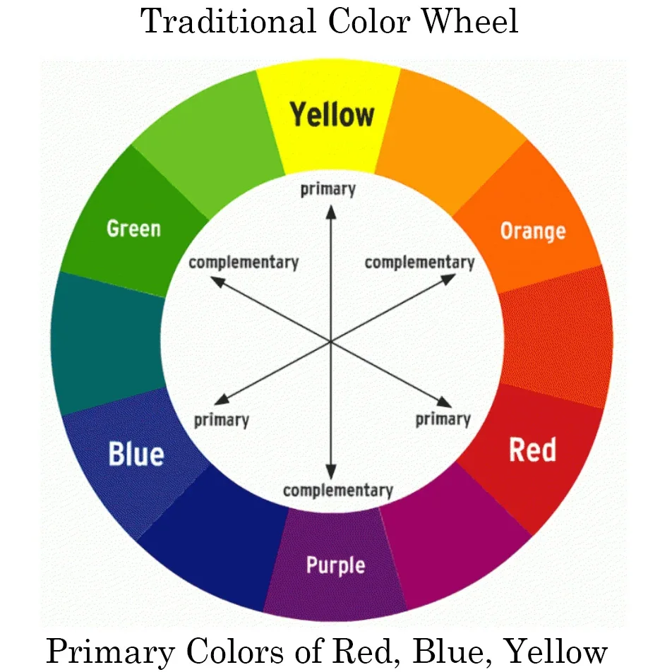
Primary Colors
Blue
Red
Yellow
Secondary Colors
Violet
Orange
Green
Complementary Pairs
Blue/Orange
Red/Green
Yellow/Violet
Complementary color lie directly across from each other on a color wheel.
Analogous colors are in a range that lie next to each other on a color wheel.
A Split Complementary color scheme uses three colors. Choose a color, then look across the color wheel for that color’s complementary color. But, instead of using the complementary color, choose two closely analogous colors on either side.
Subtractive Color -
Cyan, Magenta, Yellow
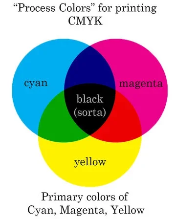
Primary Colors
Cyan
Magenta
Yellow
Secondary Colors
Blue
Red
Green
Complementary Pairs
Cyan/Red
Magenta/Green
Yellow/Blue
watch this quick video with color gels
that demonstrate CMYK subtractive color.
A Note to Photographers
CMYK - Cyan, Magenta, Yellow, Key.
Note that “K” does not mean black.
It is really a luminance value.
(Some key color, analogous to black, is used in printing to control luminance.)
But, that key color can be warm, cool, or lean towards some other color. Thinking of it as black is an easy shortcut. Noting that K/key is luminance (print) we can see the connection between the key color in CMYK and the luminance value in RGB as noted in Color Readout in Capture One.
Additive Color -
Red, Blue, Green
In reality, primary colors don’t exist. These are just models. What exists is a range of visible wavelengths on the electro magnetic spectrum. Our eyes have 3 different color receptors. Red, blue, and green (RGB) are the closest description of what those receptors can see. Therefore, creating an array fo RBG diodes is an effective way of projecting visible light/color from a computer to our eyes. Since RBG is projected, and a combination of equal amounts of RBG creates neutral white or gray, the color model is additive (all three colors add up to white).
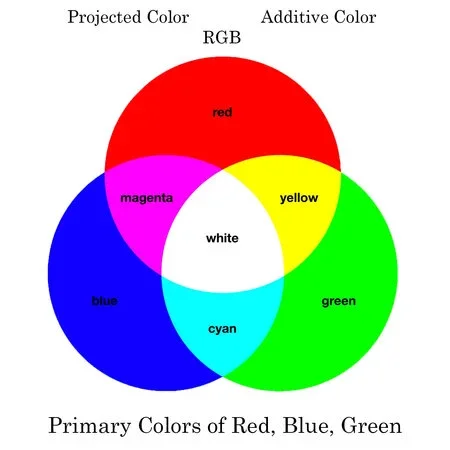
Primary Colors
Red
Blue
Green
Secondary Colors
Magenta
Cyan
Yellow
Complementary Pairs
Blue/Yellow
Red/Cyan
Green/Magenta
A Note To Photographers
Look at White Balance and Tint adjustments.
Notice the slider holds complementary colors.
Blue/Yellow
Green/Magenta
Use the colors above to see how the RBG arrays combine to create colors.
Green + Red = Yellow
Red + Blue = Magenta
Blue + Green = Cyan
If something is appearing red,
and you slide the White Balance towards blue,
then that red will start to turn magenta.
(moving White Balance away from yellow)
If something is appearing yellow,
and you slide the Tint towards magenta,
then that yellow will start to turn red.
(moving Tint away from green)
Cyan/Magenta/Yellow is subtractive. Light is not projected from objects, but reflected off objects. As light hits an object, some of the wavelengths are absorbed, and only part is reflected back to our eye, appearing as a color (not the equal mix that makes white).
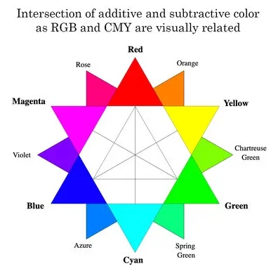
Subtractive and Additive color models do intersect. When place on top of each other, we can see how subtractive (Blue/Red/Yellow or Cyan/Magenta/Yellow) relate to the additive color model used in computer screens (Red/Green/Blue).
The old subtractive model that we learned in elementary school (Red/Blue/Yellow) might be effective for painting or drawing, but it does not translate well to the digital world or process printing.
Since CMY intesects with RBG so easily (see illustration), its much easier to map RBG colors from our computers to CMY colors found in a modern printer.
Click here to start playing with color and contrast.