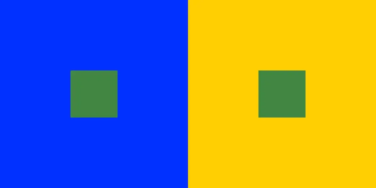
Simultaneous Contrast
When a color looks different, depending on the color is is next to. It's just a relative shift, and not reflected color contamination. Look at the yellow/blue image with the two green boxes. Those green boxes are exactly the same color and luma (exact same hex code in PS).
Remember, color is a model, so we can discuss what we are seeing.
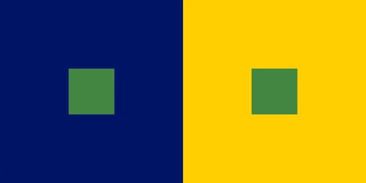
The relative difference changes as the larger color boxes change.
The small green boxes are still the same as above.
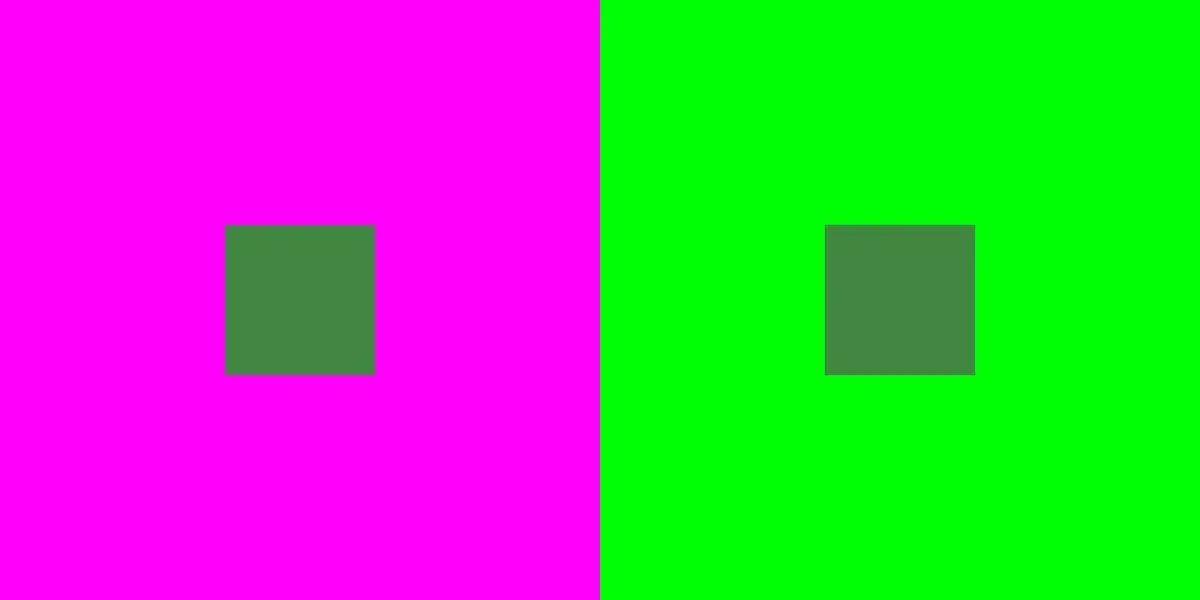
Change from blue/yellow to magenta/green and the relative difference changes again.
The small green boxes are still the same.
(do they still look the same?)
The only thing changed in the next image is the luma of the big squares.
Small green ones are still the same.


Small green squares are all the same.
The point of this exercise is not to try to beat the game.
The point is to simply start noticing when you see differences that do not exist in absolute terms.
Look for perceived differences in the constant (the small green boxes),
because things around them changed.
It works with grayscale too.
Let’s start with a 50% gray field.
As the small boxes appear,
keep in mind that they will stay 50% gray.


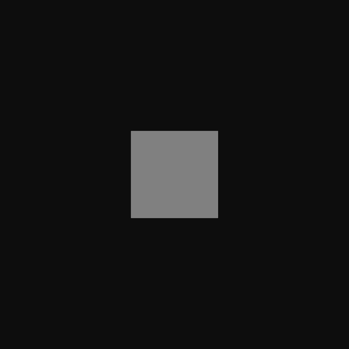

Small boxes stayed 50% gray.

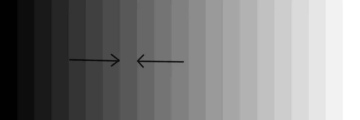
Take a close look at this step wedge.
The differences in the rectangles are significant enough to easily see.
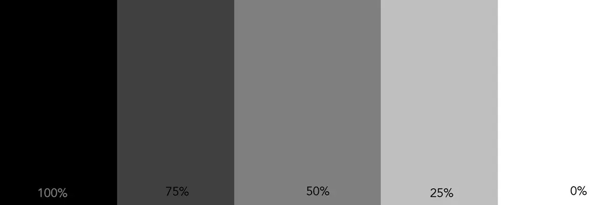
They are in a simple logical sequence from dark to light.
We can see that.
But, remember, our assessment is relative.

If there is even one variation in the pattern,
our ability to see tone, with certainty, starts to falter.
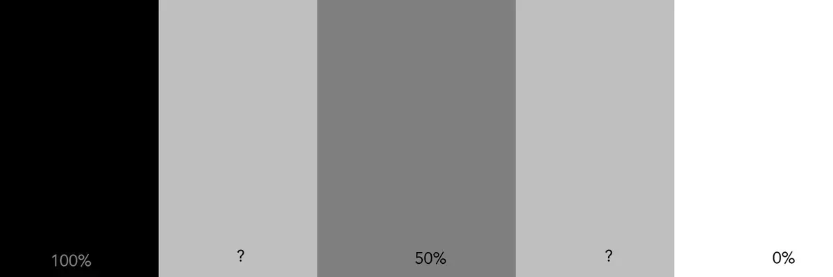
The blocks on the ends, and the one in the middle have not changed.
Do the other two look the same or different?
Our perception of them is affected by the blocks next to them.
This was an easy one.
It was easy because the image is simple and the gray fields are large.
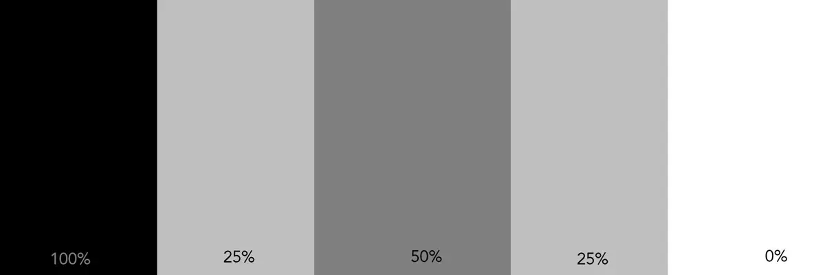
As simple as this is,the 25% blocks can still look different
because of their location next to different blocks.
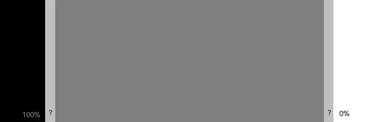
It starts to get more challenging as the two columns move apart.
Our vision has to cover more ground to compare the two.
In that process, we less of the overall picture,
and more of the tones that immediately surround the columns.
For many, the thin column on the left looks ligher than the column on the right.
They are, in reality, exactly the same.
Look very carefully.
Is this column the same tone throughout,
or do you see a tonal shift from left to right?

If we isolate the column by making all the others 50% gray,
we can see the answer.
Click here to see how subtle color shifts can effect gray.