Hex, Hue, and Harmony: A Color Theory Walkthrough
You already know the color wheel. Red, yellow, and blue, sitting 120 degrees apart, with orange, green, and purple filling the gaps between them. That wheel doesn't go away when you start working in screens and hex codes, it just gets a new set of primaries. This page walks through how that translation works, starting from the smallest possible unit, a single hex digit, and building up to a real-world test of the whole system against an actual published dataset of colors.
Work through it in order. Each section leans on the one before it.
1. Reading a hex code
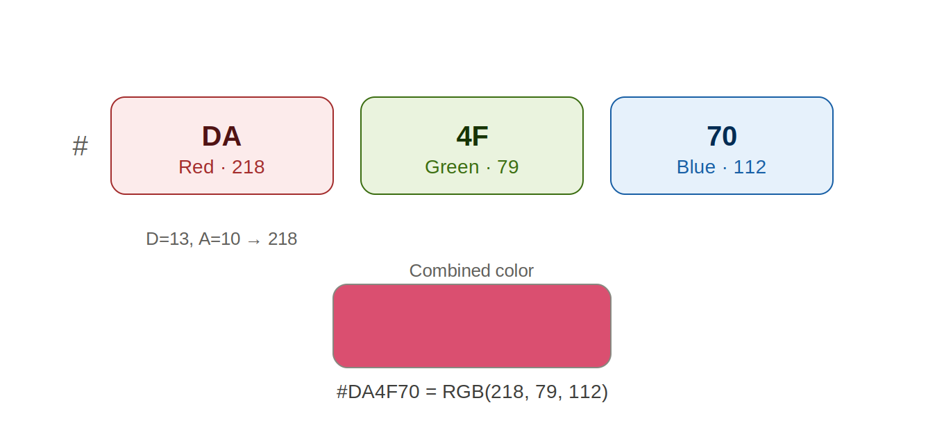
A hex color code is the # sign followed by six characters, split into three pairs.
Each pair is one color channel: red, green, then blue, in that order.
Take #DA4F70. DA is the red channel, 4F is green, 70 is blue.
Each pair is a number written in base 16 instead of base 10.
Base 16 needs sixteen digits, so after 0 through 9 it keeps going with A through F, where A is 10, B is 11, C is 12, D is 13, E is 14, and F is 15.
A two-digit hex pair works the same way any two-digit number does: first digit times 16, plus the second digit. That's why DA becomes 218: D is 13, A is 10, so 13 × 16 + 10 = 218.
The smallest pair is 00, the largest is FF, so every channel is a brightness value somewhere between 0 and 255.
So the six characters aren't one number, they're three independent numbers stuck together, each one saying how much of that color of light to mix in. This is additive mixing, the kind your eye does with light, not the subtractive mixing you get from paint. More of all three together pushes toward white, not toward brown.
Try this yourself: take a hex code from your own design software and split it into its three pairs by hand. Convert just the first pair to decimal using the formula above, then check it against what the software tells you the red value is.
2. The hue wheel you already teach, mapped to light
Here's the translation: in the digital color wheel, the three primaries aren't red, yellow, and blue, they're red, green, and blue, the actual channels from Section 1. They still sit 120 degrees apart, exactly like the wheel you teach. The difference is why there are three primaries in the first place. Paint mixes by subtracting light, mixing pigments removes wavelengths. Screens mix by adding light, stacking red, green, and blue glow on top of each other. Different mixing method, different primaries, same 120-degree structure.
The wheel uses degrees, 0 to 360, going all the way around. Red sits at 0°, green at 120°, blue at 240°, each exactly 120° from the other two. Halfway between each pair of primaries sits a secondary, made by mixing its two neighbors at full strength: yellow at 60° (full red plus full green), cyan at 180° (full green plus full blue), magenta at 300° (full red plus full blue). That's the same relationship orange, green, and purple have to red, yellow, and blue on the wheel you already teach, just shifted to a different set of primaries.
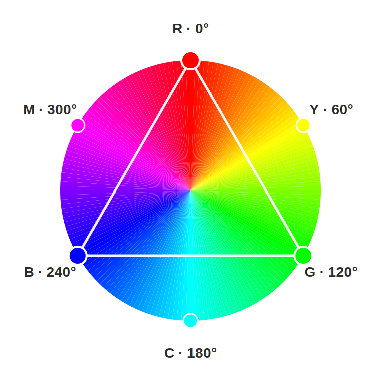
Try this yourself: pick any hue value and add 120, then add 120 again (wrapping past 360 back to 0 if you need to). Those three hues are a triadic harmony, evenly spaced around the wheel, the same scheme you already think in, just expressed in degrees instead of paint names.
3. The third number: lightness/lumanence
Hue alone isn't a color. It's a direction, a position on the wheel's rim. To actually land on a specific color you need two more numbers: saturation, how vivid versus gray the color is, and lightness, how close to black or white it is. Together, hue, saturation, and lightness make up the HSL model, and hex codes are just one more way of writing down an HSL value.
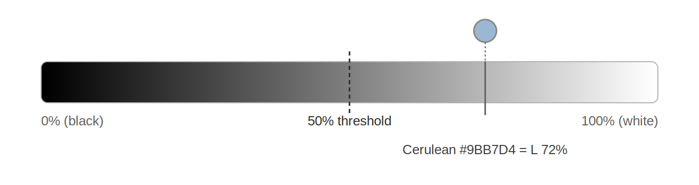
Lightness runs on a 0 to 100% scale. 0% is pure black, 100% is pure white, and 50% is the pivot point, the most intense version of whatever hue you're looking at, tinted toward neither black nor white. That 50% mark is the natural threshold for calling a color light or dark: above it, light; below it, dark.
The formula, from RGB: convert each channel to a 0 to 1 fraction, then lightness equals the average of the highest and lowest channel. The middle channel doesn't factor in at all, only saturation depends on that one.
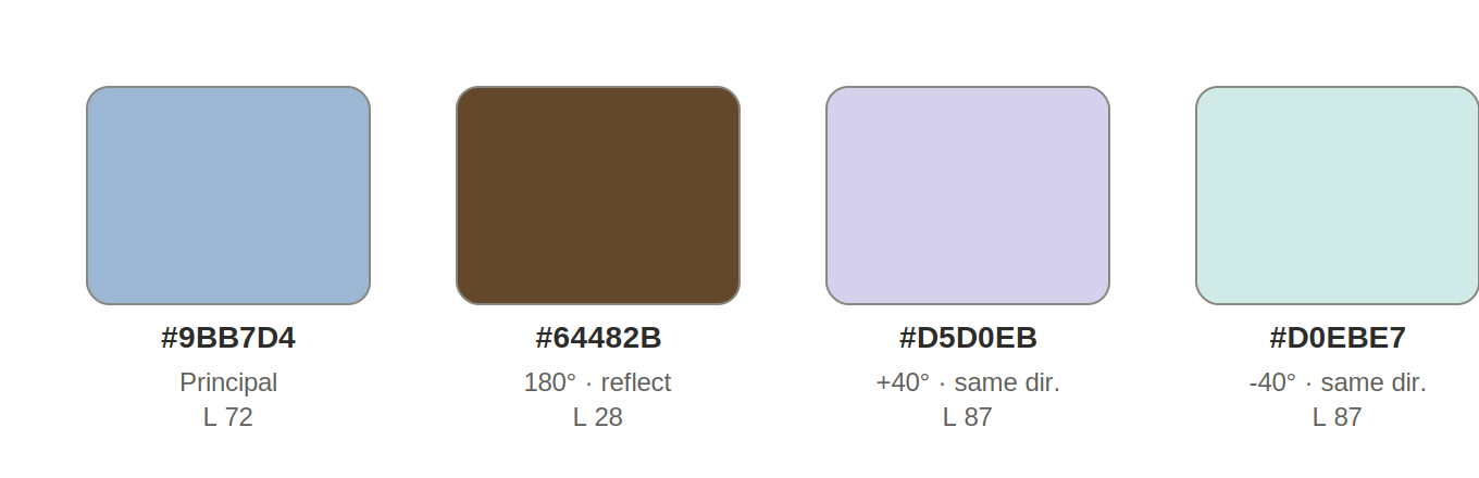
Take Cerulean, Pantone's color of the year for 2000, hex #9BB7D4. As RGB fractions that's 0.608, 0.718, 0.831. Lightness equals (0.831 + 0.608) ÷ 2 = 0.72, or 72%. Solidly on the light half of the scale, which matches how it looks, a soft, pale blue.
One catch worth flagging: HSL lightness treats red, green, and blue as equally bright, but eyes don't. Blue reads as noticeably darker than green or red at the same lightness number. A formula that weights green heavily and blue lightly (the kind used for screen accessibility contrast) would put Cerulean closer to 46%, just barely on the dark side of the same 50% line.
Try this yourself: compute the lightness of a pure, fully saturated blue (#0000FF) and a pure, fully saturated yellow (#FFFF00) using the formula above. Both come out at exactly 50%. Now look at them side by side and ask the class whether they actually look equally bright.
4. Designing a harmonious secondary palette
This is where the wheel becomes a design tool instead of just a diagram. Start with one principal color and derive two secondaries from it, using rules for both hue and lightness.
The hue rule comes straight from Section 2: pick two hue offsets and rotate. Across this whole project the offsets that ended up mattering most were 180° (the exact complement, directly across the wheel) and a second, smaller offset.
The lightness rule took a few tries to get right, and walking through why earlier versions got replaced is as useful as the final version itself.
First attempt: measure how far the principal sits from 50%, then move the secondaries the same distance in the opposite direction. Cerulean sits at 72%, which is 22 points above 50, so a secondary would land at 50 − 22 = 28%. Clean, but only describes one secondary; a second one was added at half that distance (50 − 11 = 39%).
Second attempt: instead of measuring from 50%, use a fixed number of points (say, 33 and 15) and shift the secondaries from the principal's own lightness, not from the midpoint. This is the version that actually needs a safety clamp, because shifting away from an already-extreme principal can push a secondary past 0% or past 100%. Try it on Cloud Dancer (2026's color of the year, lightness 93%) and a "same direction, lighter" secondary wants to land past 100% entirely.
Final, locked-in version: the 180° secondary's lightness is simply 100 minus the principal's lightness, a clean reflection through the midpoint, no clamp ever required for any realistic principal. The second secondary keeps the fixed-shift rule (move 15 points in the same direction the principal sits from 50%), clamped between 5% and 90% so it never produces an invalid color.
Running Cerulean through the finished rule: principal #9BB7D4 (hue 210.5°, lightness 72%), reflected secondary at hue 30.5° and lightness 28%, second secondary tested at both +40° and −40° hue, lightness 87% either way.
Try this yourself: run the same three-attempt sequence on a very dark color (try Pantone's Chili Pepper, 2007, lightness 36%) and a very light one (Cloud Dancer, lightness 93%). Note which version of the lightness rule needs the clamp and which doesn't, and why.
5. When the wheel lines up exactly
Once you have a hue-shifting rule, an interesting question follows: for any given principal color, do the secondaries ever land on a familiar landmark, one of the six pure hues (red, yellow, green, cyan, blue, magenta), each sitting at an exact multiple of 60°?
The expectation, going in, was that a yellow secondary should show up somewhere. It never did, for one specific, checkable reason. Yellow sits at exactly 60°. Reaching exactly 60° from a principal color using moves of plus or minus 60° or 120° only happens if the principal's own hue is itself a multiple of 60°. Cerulean's hue is 210.5°, almost exactly halfway between cyan (180°) and blue (240°), about as far from any pure landmark as a hue can get. Every secondary inherits that same offset, so none of them ever land on yellow, or on any other pure hue.
But the offset that breaks one set of moves can be exactly what a different set of moves needs. Cerulean's hue happens to sit almost exactly 30° past a multiple of 60°. Since 30°, 90°, −30°, and −90° are all themselves congruent to 30° on a 60° cycle, every one of those four moves from Cerulean lands within half a degree of a pure landmark, blue, green, cyan, and magenta. The 60/120 grid and the 30/90 grid are complementary: one resonates with colors sitting on the six landmarks, the other resonates with colors sitting almost exactly between them.
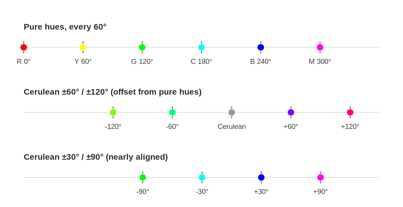
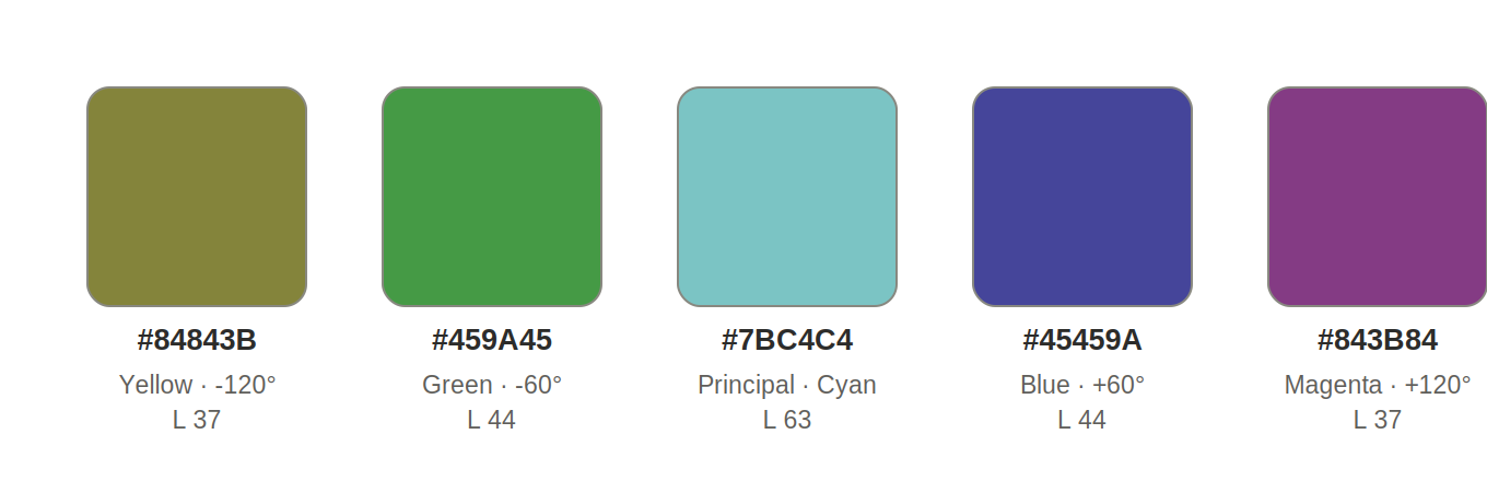
Checking every color in the Pantone Color of the Year list (more on that list in Section 6) for which one sits exactly on a landmark turns up a single perfect case: Aqua Sky, 2003, hex #7BC4C4. Its green and blue channels are numerically identical, 196 and 196, which is the precise condition for a hue of exactly 180.0000°, dead-center cyan, no rounding involved. Since cyan is itself one of the six pure hues, every one of Aqua Sky's 60/120-degree secondaries lands exactly on another pure hue: yellow, green, blue, and magenta, one each.
Try this yourself: pick any hex code and find its hue. Divide that hue by 60 and look at the remainder. A remainder near 0 means 60/120-degree moves will land near pure hues. A remainder near 30 means 30/90-degree moves will. A remainder near 15 or 45 means neither grid gets especially close, and that color won't produce any tidy landmark hits at all.
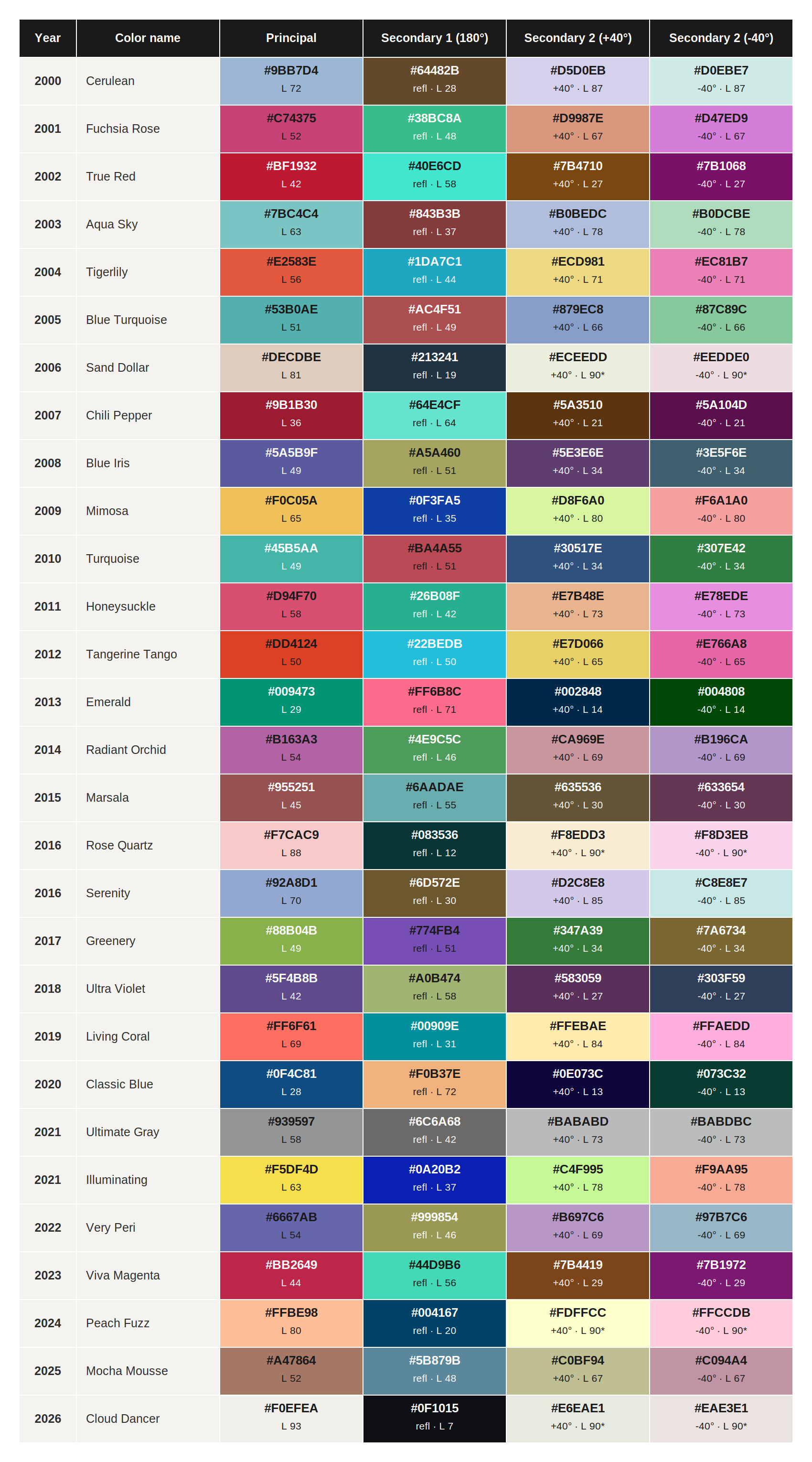
6. Running the rule on a real dataset
Everything above was developed and checked against one principal color at a time. The real test of a rule is running it across a dataset it wasn't designed around.
Pantone's Color of the Year program has named a color every year since 2000 (the program itself started in 1999, naming the first color for the year 2000). Two of those years, 2016 and 2021, got two colors instead of one, which makes 29 individual colors across 27 years, a list specific enough to be a genuine test case, not a cherry-picked example.
Running the finished rule from Section 4, the 180° reflection plus the 40° same-direction secondary, across all 29 colors produces the full table below. Every cell carries its own hex code and lightness value, so you can check the math on any row without a separate reference sheet. Four rows hit the 5% to 90% clamp, marked with an asterisk: Sand Dollar, Rose Quartz, Peach Fuzz, and Cloud Dancer, all four among the lightest principals in the set, exactly where the rule predicts a clamp should show up.