JUS10H Tokyo Mini Lookbook
A Clean Brief. A Shared Vision.
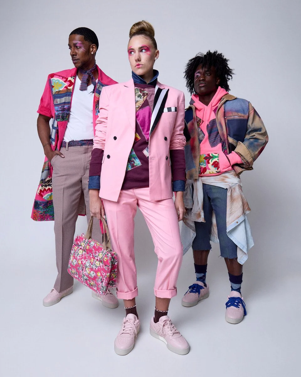
Five Looks Built for an International Audience.
When the Tokyo Fashion Council asks for clean, that word carries weight. It is not a suggestion. It is a standard, and it is one that leaves room for interpretation in the best and most challenging way. Designer Justin Haynes knew what he wanted the collection to feel like. Translating that feeling into a visual language that would read clearly to an international audience was the work we did together before anyone stepped in front of a camera.
The answer was straightforward once we talked it through. A white cyclorama wall. An industry standard lighting pattern that lets the background fall to a soft, familiar gray. Nothing in the frame that would distract from the clothing. No color shifts, no stylized backgrounds, no editorial choices that might feel foreign to a Tokyo buyer or press contact. The JUS10H aesthetic, the styling, the makeup, the patchwork, the layering, all of it stayed exactly as Justin intended. The photography simply got out of its own way.
The Collection: Pink, Burgundy, Blue,
and the Space Between
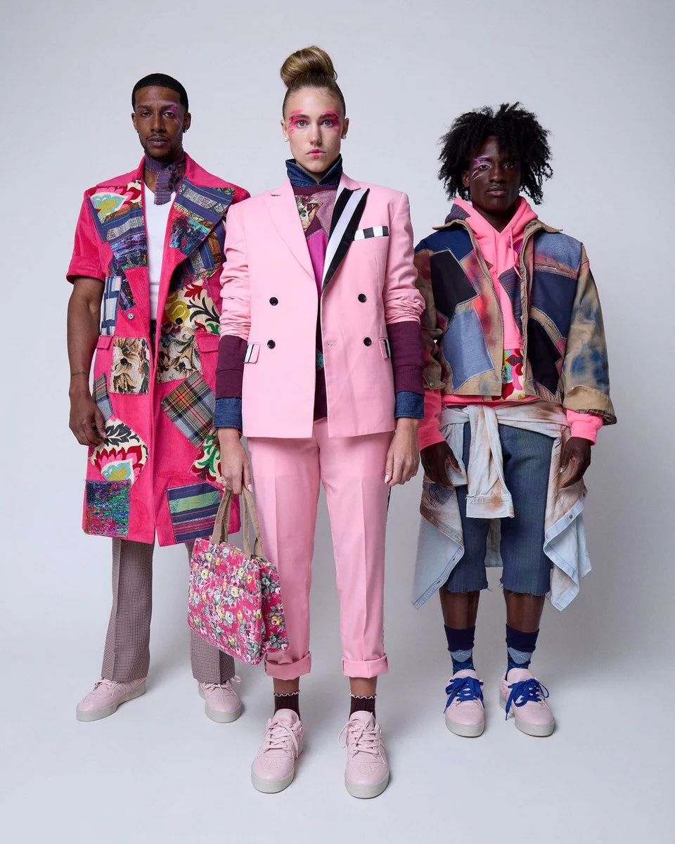
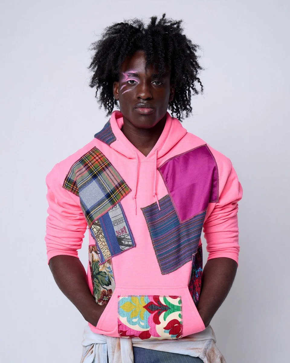
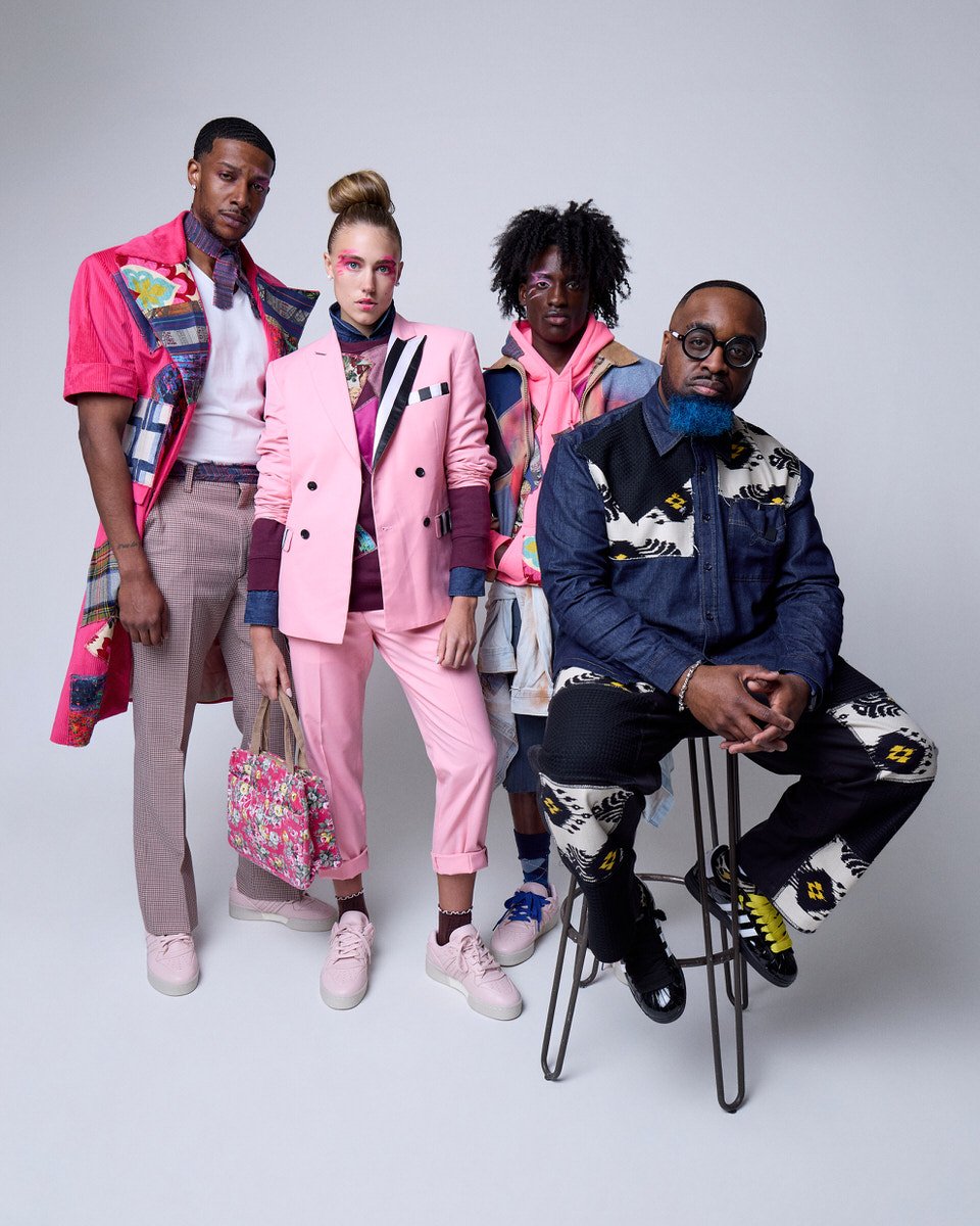
The palette is built around light and rich pinks as primary tones, with a cool blue that leans toward violet acting as the counterweight throughout. Together they are warm without being sweet, confident without being loud.
The patchwork that defines the JUS10H signature is present across all six looks, but here it reads differently against the clean gray background. The large scale patches, roughly seven inches square, in full spectrum patterns with blue and white as recurring anchors, feel considered rather than layered. The garments have always had this quality. The photography finally gives it room to breathe.
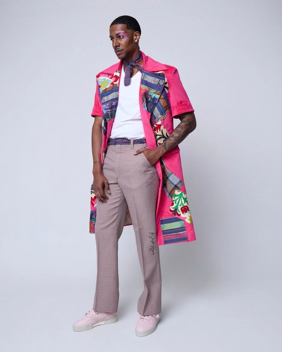
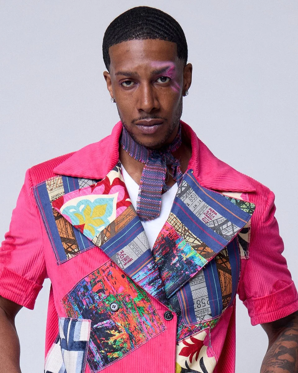
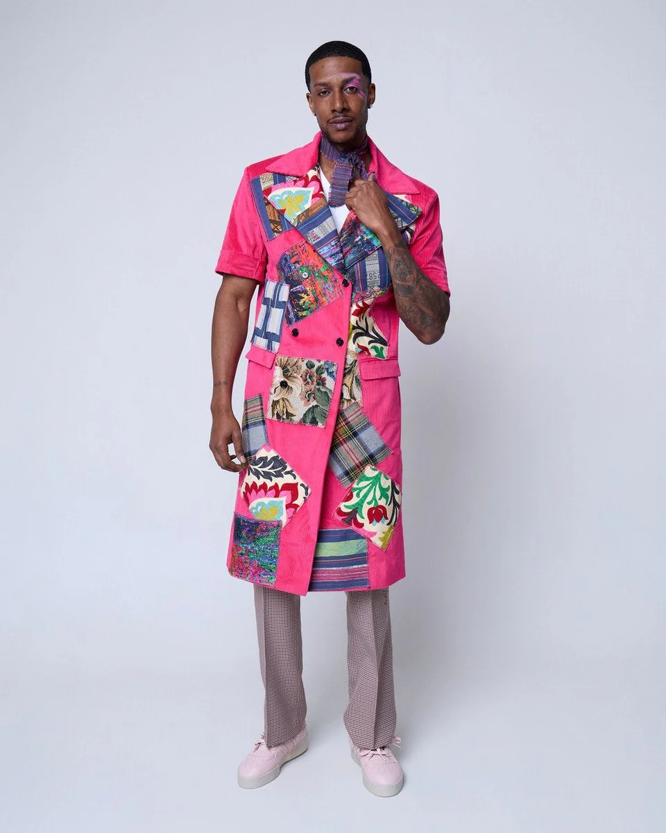
Look 1: The Trench
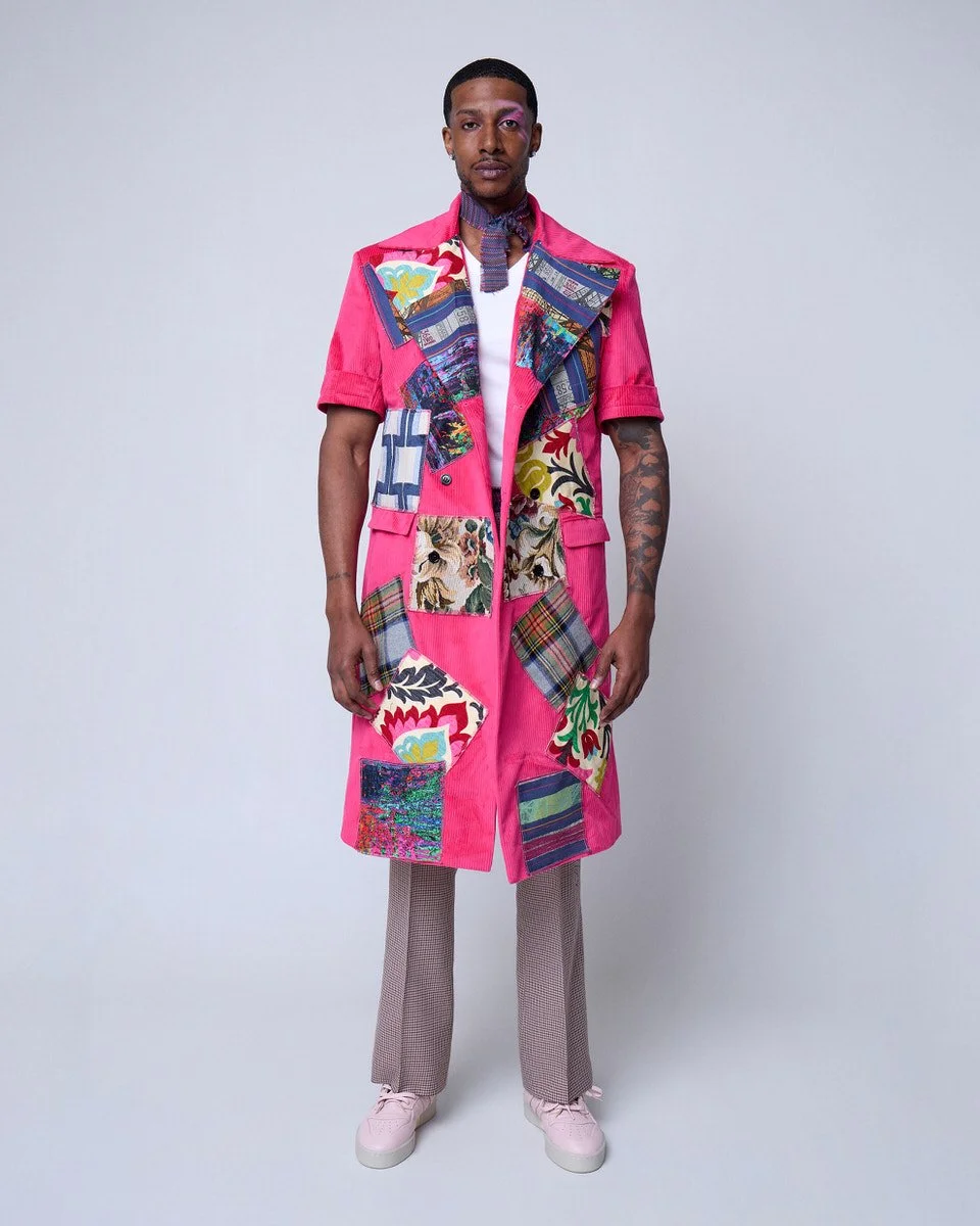
A bright pink trench coat cut to just below the knee anchors the opening look. The patchwork covers the coat in large colorful panels that touch and overlap slightly, each one distinct, together forming something cohesive. Underneath, a white tee and rose-tan slacks with a sharp front crease keep the foundation clean. A torn strip of blue, red, and purple striped fabric tied loosely at the neck adds exactly the right amount of intention without trying too hard. Pale pink sneakers complete the look from the ground up.
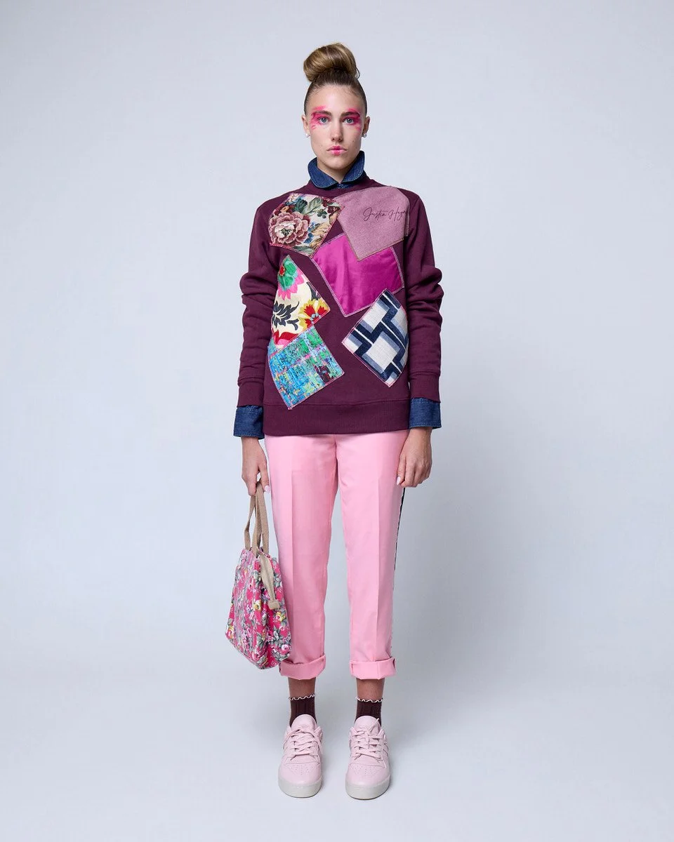
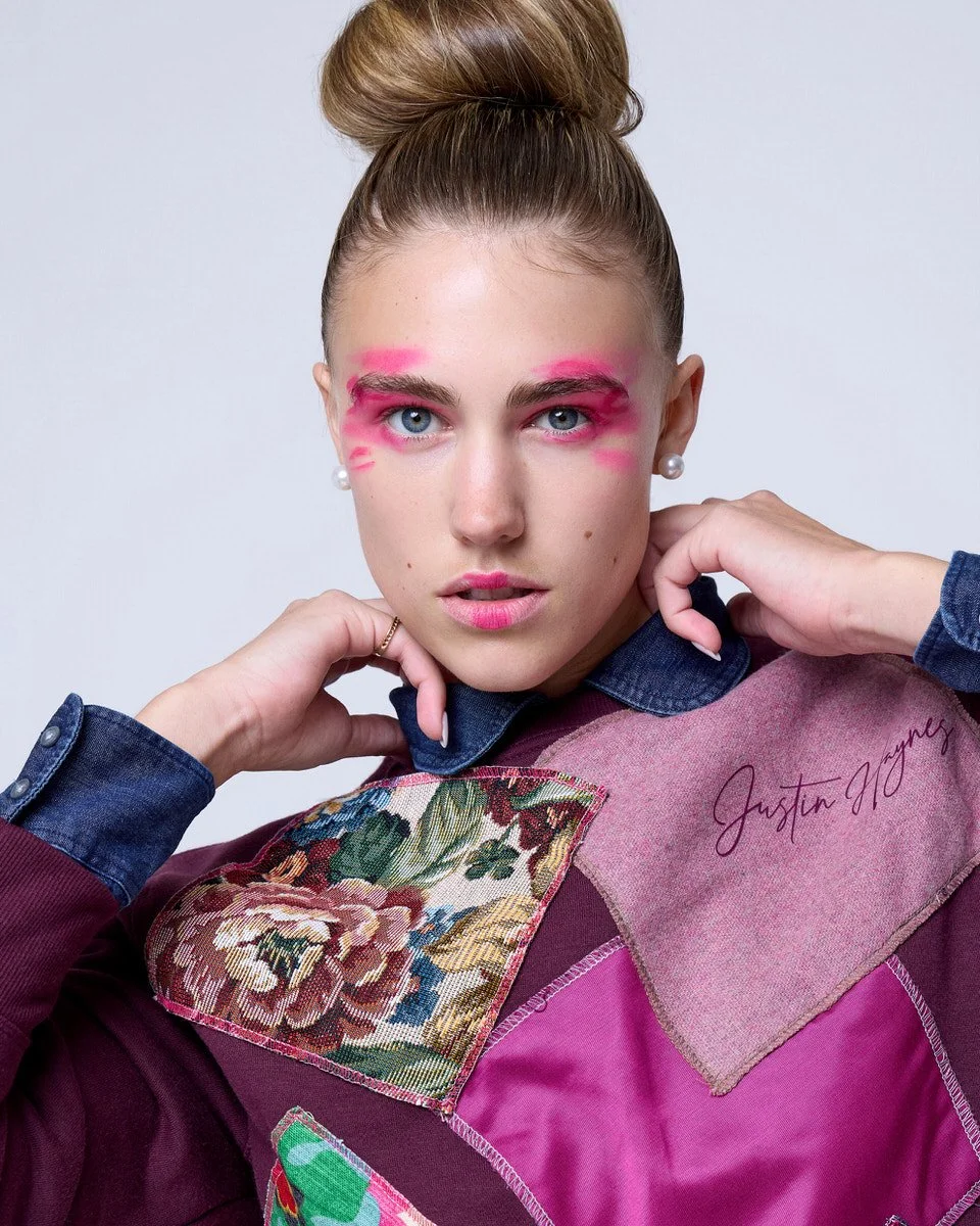
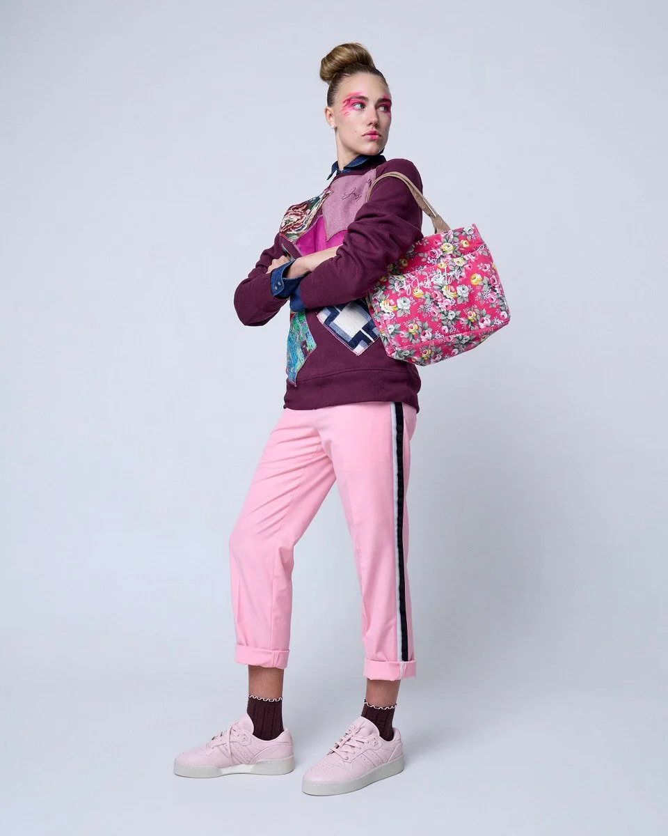
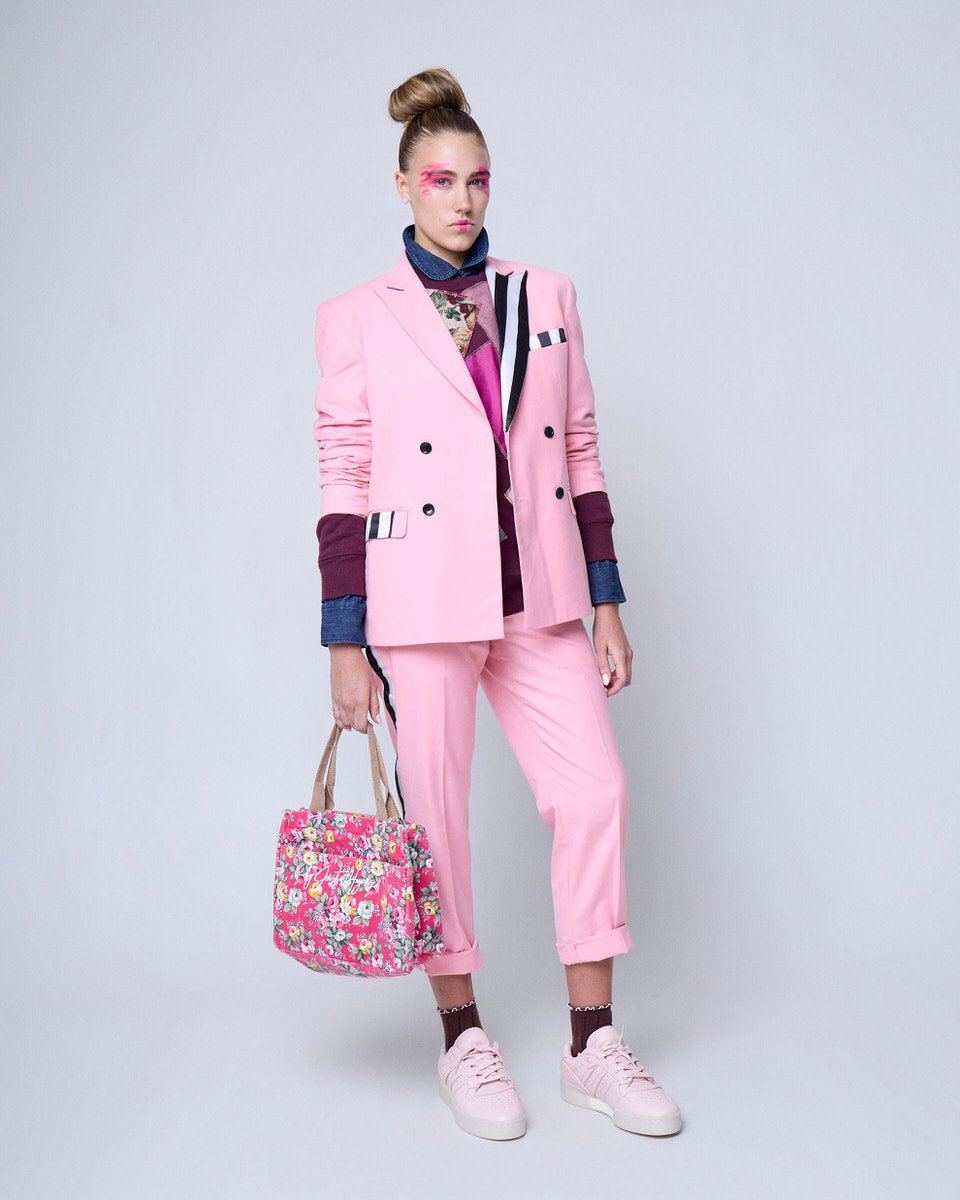
Looks 2 and 3: The Pale Pink Suit
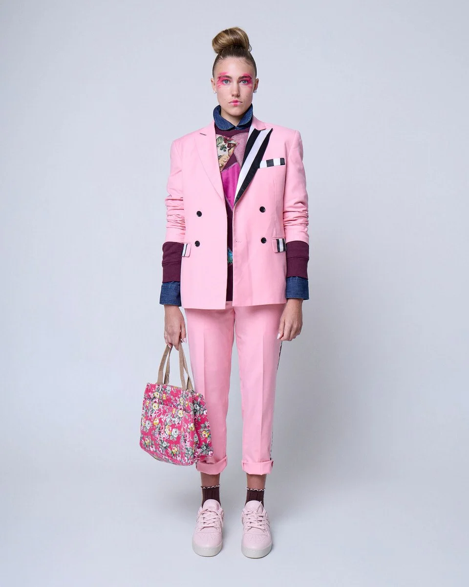
Look 2 is built around a pale pink suit, the kind of pink that is one shade away from neutral but never quite gets there. The jacket lapels and pocket flaps are trimmed in thick black and white stripe. Black buttons. Sleeves pushed to the elbow. Underneath, a dark burgundy crew neck sweatshirt with its own patchwork detail, and beneath that, a dark denim collar shirt with the collar soft and open. Rolled pant cuffs reveal a flash of burgundy sock above the pale pink sneakers. A floral bag in medium pink, yellow, green, and blue hangs casually at the model's side. Look 3 removes the suit jacket to let the sweatshirt carry the look on its own
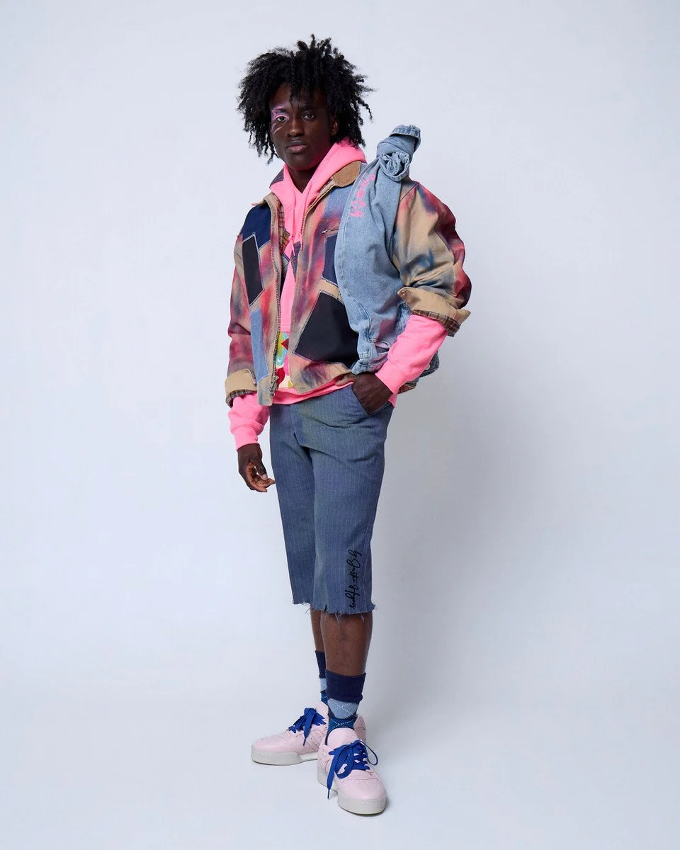
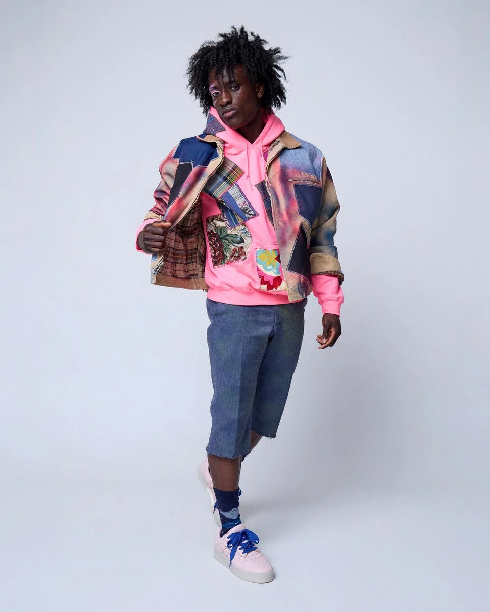
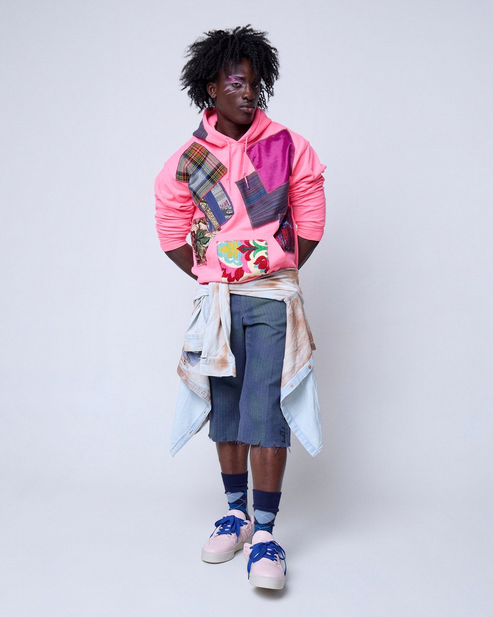
Looks 4, 5, and 6: The Bomber
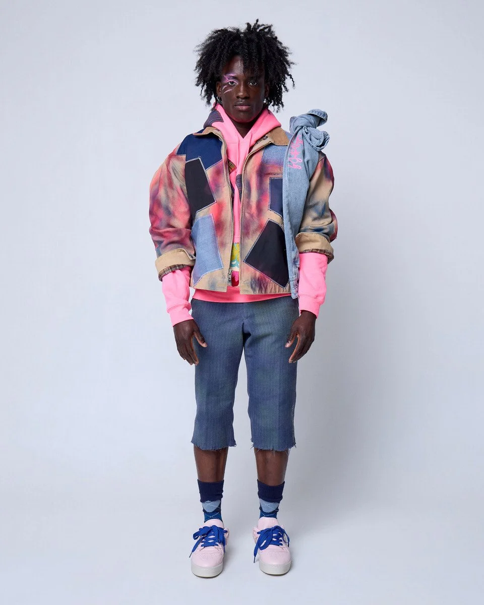
The final three looks build around a tan bomber jacket marked with red, pink, and orange spray paint and covered across the front with six large patches alternating deep, middle, and light denim blue. The base is a pink sweatshirt over blue striped slacks cut just below the knee, with dark blue argyle socks and pale pink sneakers now laced in thick middle blue. A pair of light blue denim jeans tied by their pant legs over the left shoulder adds an accent piece that is equal parts practical and deliberate. Look 5 removes the tied jeans. Look 6 removes the bomber entirely, ties a lightweight denim shirt at the waist, and reveals the patchwork on the pink sweatshirt underneath.
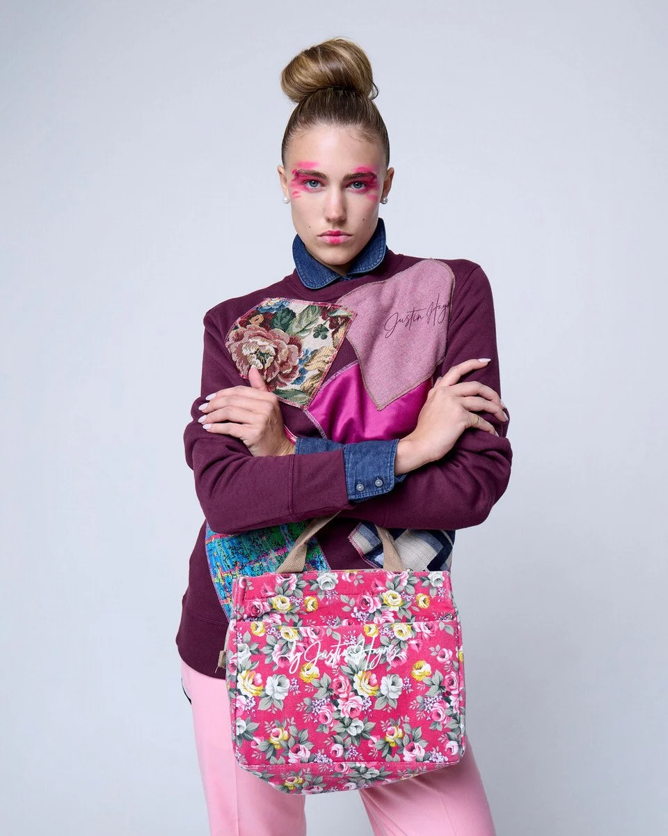
The Designer in the Room
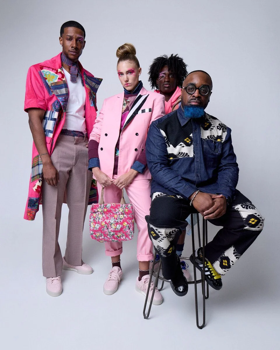
A few frames in this collection show Justin Haynes with three of his models. He is wearing black pants and a dark denim long sleeve shirt, both carrying the same large patches that run through the collection, solid darker blue alongside a white base with black and yellow geometric patterns that carry a southwest feeling. Black Adidas shell toes with white stripes and wide yellow laces. He is not performing for the camera. He is simply present, which is exactly how his clothing feels on the people wearing it.
What a Mini Lookbook Actually Does
A mini lookbook is not a compromise. It is a precision tool. For a designer presenting to an international audience, it answers a specific question quickly: who are you, and what do you make? Five looks, a neutral background, and a consistent visual language can open a door that a full campaign might overcomplicate.
The creative dialogue that shaped this shoot, the conversations about what clean means in practice, which variables to remove, which elements to protect, is the part that rarely shows up in the final images. It is also the part that determines whether those images do their job. When a photographer and a designer work together that way, the result tends to look effortless. That is usually how you know the work was done right.