Making Adjustment Curves
After you have found the base exposure time for the stochastic screen, and the image exposure time, you’ll need to constract an adjustment curve. The adjustment curve is applied to your image before printing the transparency. It compensates for the discrepencies between the digital and the analogue process.
Software used to create your transparencies does two things:
Assumes that the file you gave it has a perfect linear response with full tonal range, no clipping, true tone all the way from 0 - 100% density.
Uses a standard preset curve to present that image in a way that a software engineer assumes most people would like to see their photos.
None of this is applicable to the images you create when the final print is made.
Therefore, you must take full control of the process by doing two things:
Digitize a copy of your final printed image (in this case a series of step wedges). During this process, you must not apply any default, auto settings. You are trying to digitize raw data. Of course, it must be exposed properly, lit evenly, and be an accurate represenation of the printed image. It needs to be we What-You-See-Is-What-You-Get.
Compare the digital file used to create your transparency and the final print that you made. There will be a difference. To compensate for that difference, you build an adjustment curve that will be applied to the digital file so that, ideally, the next set of prints is closer to looking like the digital file.
To make adjustment curves, you have a few options. All of them require exposing an image of a step wedge. You can do that with the parity approach , the basic, or the advanced methods for figuring out image exposure times. This secction starts with the results from the later.
Start Training Your Eyes
Take a look at this image.
The pair of step wedges on the right are digital copies of what as printed on the transparency.
The pair of step wedges on the left are the best versions of the photogravure prints, made from a plate that was exposed to the transparencies made from the digital image on the right.
Notice a difference?
The steps that follow will build an adjustment curve to compensate for those differences.
The digital (right) is the input. It is what was requested of the process.
The print (left) is the output. It is the result.
To make the output better match the input, we need to modify how we are entering that input. For example, if we input 80%, and the output is not yielding 80%, then we need to adjust our input so the output is actually 80%.

Note: Some of this can be adjusted during the printing process. More accurately, poor intaglio printing techniques will increase the difference between the theoretical gray tone scale of the digital world and the actual tonal range found in the print. The final printing process has less dynamic range than a digital file, so the contrast shifts, depending on the printing process and the process of creating the plate. I recommend spending a lot of time focusing on the physical practice of making prints with the etching press. As your printmaking skills improve, you may find that a better tonal range emerges from the same plate. If you do find this happening, then you should repeat the steps found in this section to create a more refined adjustment curve.
Launch Photoshop and open the scanned image of your step wedge print.
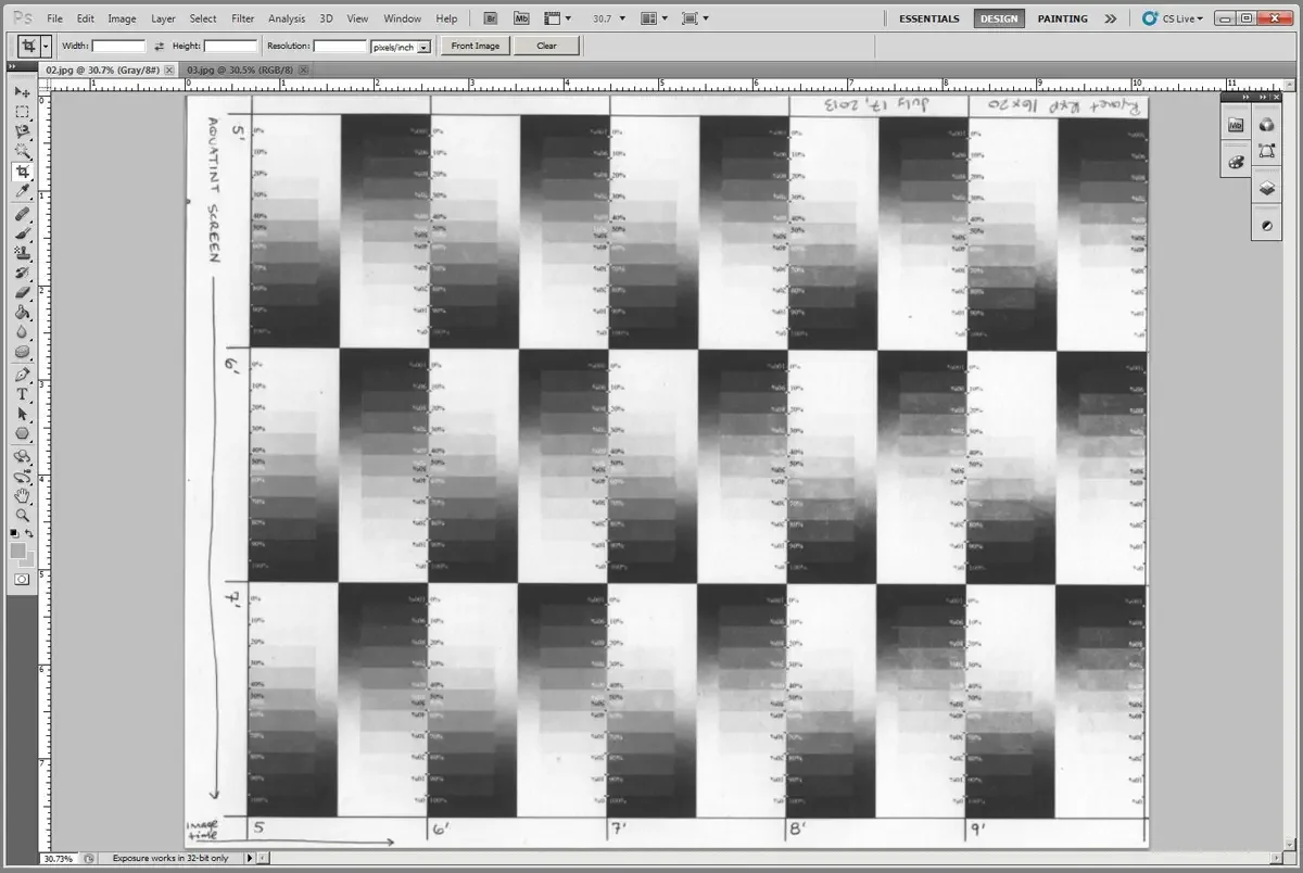
Also open the digital image used to make the transparency.

Choose the step wedge with the best exposure time (the one that reveals the best looking tonal range) and crop the image to fit just that section. The best step wedge in this exampe is the one with a 5 minute “screen” exposure (“aquatint” or stochastic screen) and a 5 minute “image” exposure using the RXP 16×20 exposure unit.
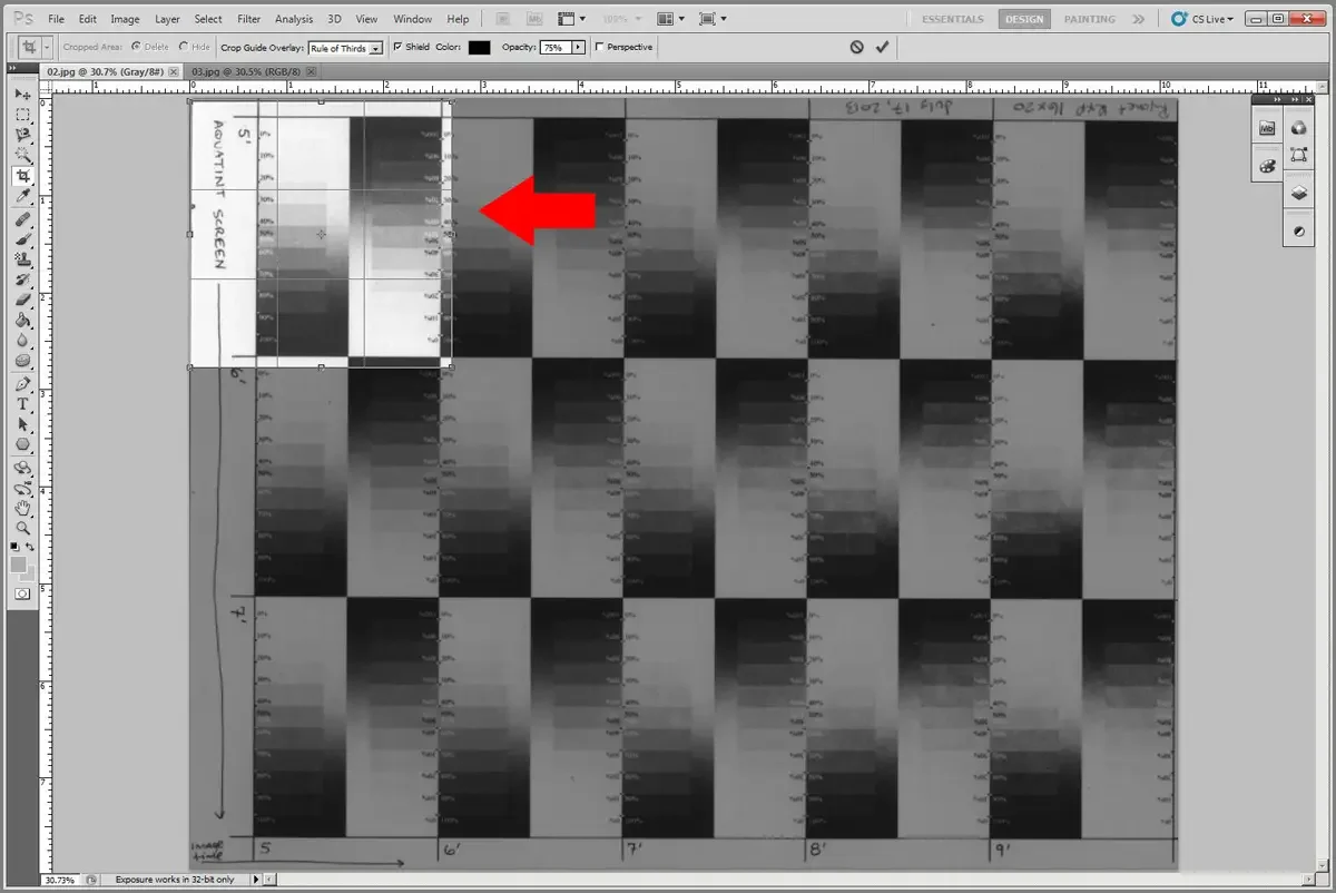
Get in close. Crop tight. Straighten if needed.

Do the same for the digital file.
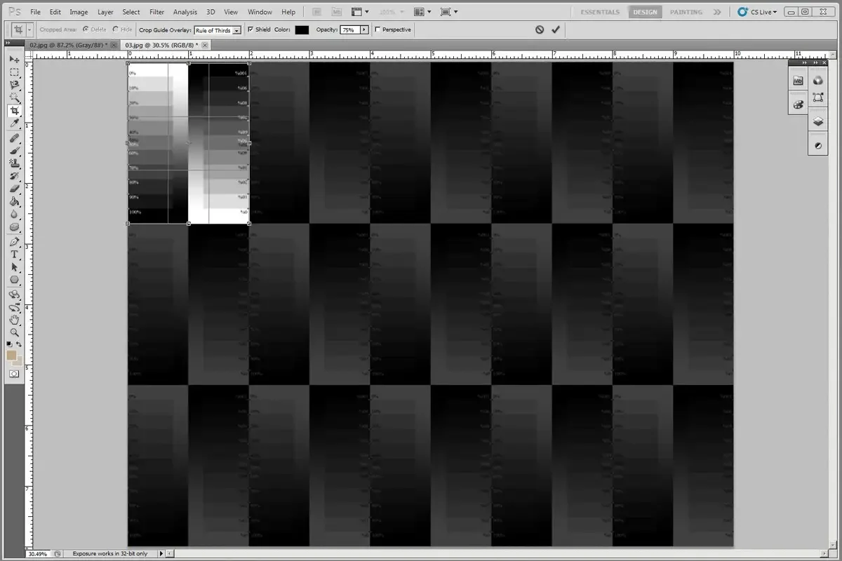
Crop the image. This digital image will act as the target. It will anchor your visual inspection of the scan of your print as you build the adjustment curve.
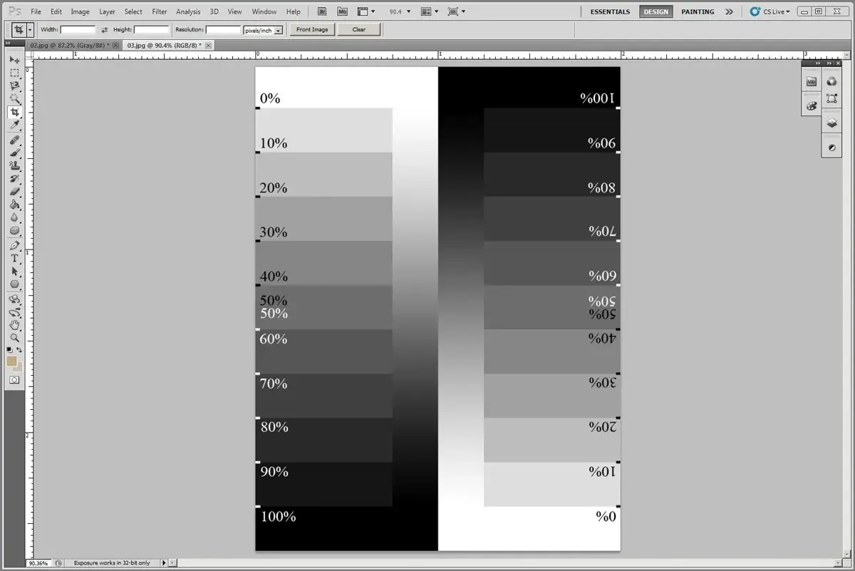
Copy and past both the analogue print and the digital step wedge into a new image. Place the print on the bottom layer and the digtial layer on top.
Label the layers so you can track them.
Notes on Color Space, bit depth, and Photoshop:
This section assumes that all files are in the same color space, with the same bit depth, and that you have a working knowledge of Photoshop. The debate about which color space to use, which bit depth gives better results, and how to capture images for accuarcy is as varied as the photography world. Regardless of which one you use, the single most important thing to remember is that both images, both layers, must use the same color space, the same bit depth, the same settings. If you are looking at two different file types, then none of this will work. Consistency is key.
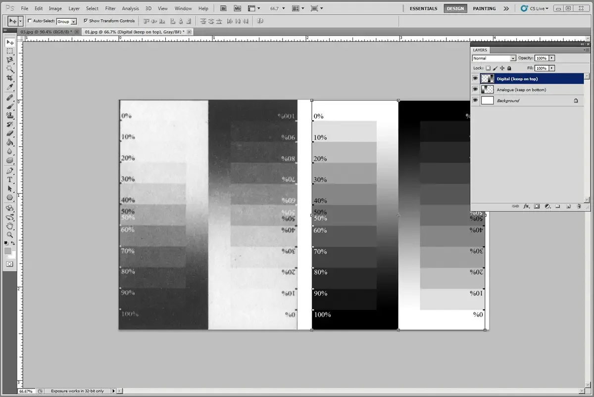
Move the digital layer on top of the analogue layer until the corresponding step wedges are next to each other for easy comparison. In this example, we are comparing the strips with 0% at the top.
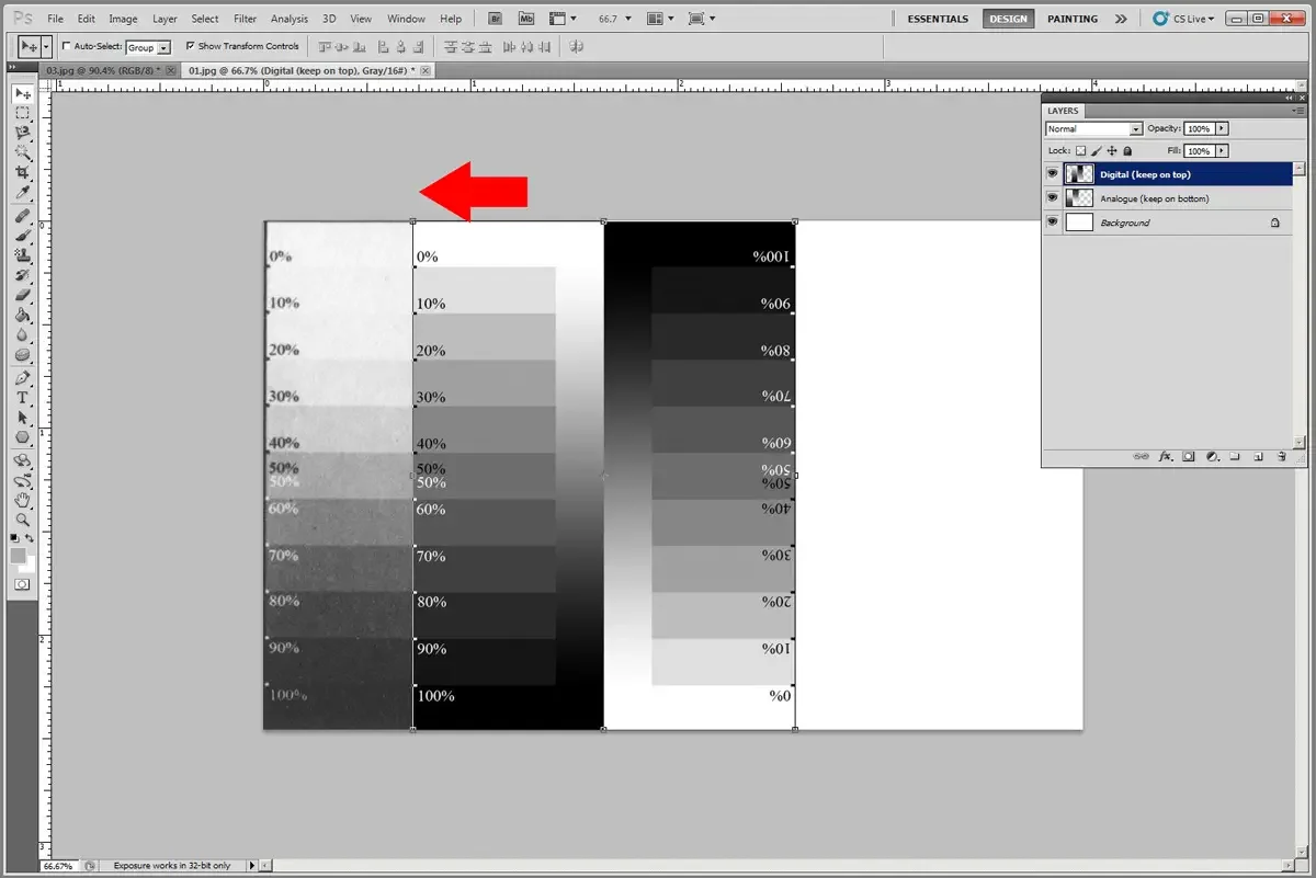
Printmaking paper is not the same 0% density (white) that a digital file will show. And, the ink will also not produce the same 100% density (black) that a digital file will show. The first step in this process is to accept printmaking paper as 0% and printing ink as 100% densities.
Create a Levels layer.
Make sure it is above the analogue layer but below the digital layer in the layer stack.
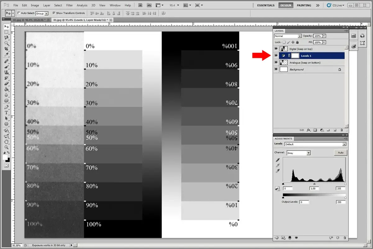
Move both the black and white sliders on the Levels layer until they are just barely touching the outside edges of the histogram.
Since the Levels layer is above the analogue layer, it should only affect that layer.
Since the Levels layer is below the digital layer, it should not affect that layer.
The next step makes it easier to see the tone of each step in the print.
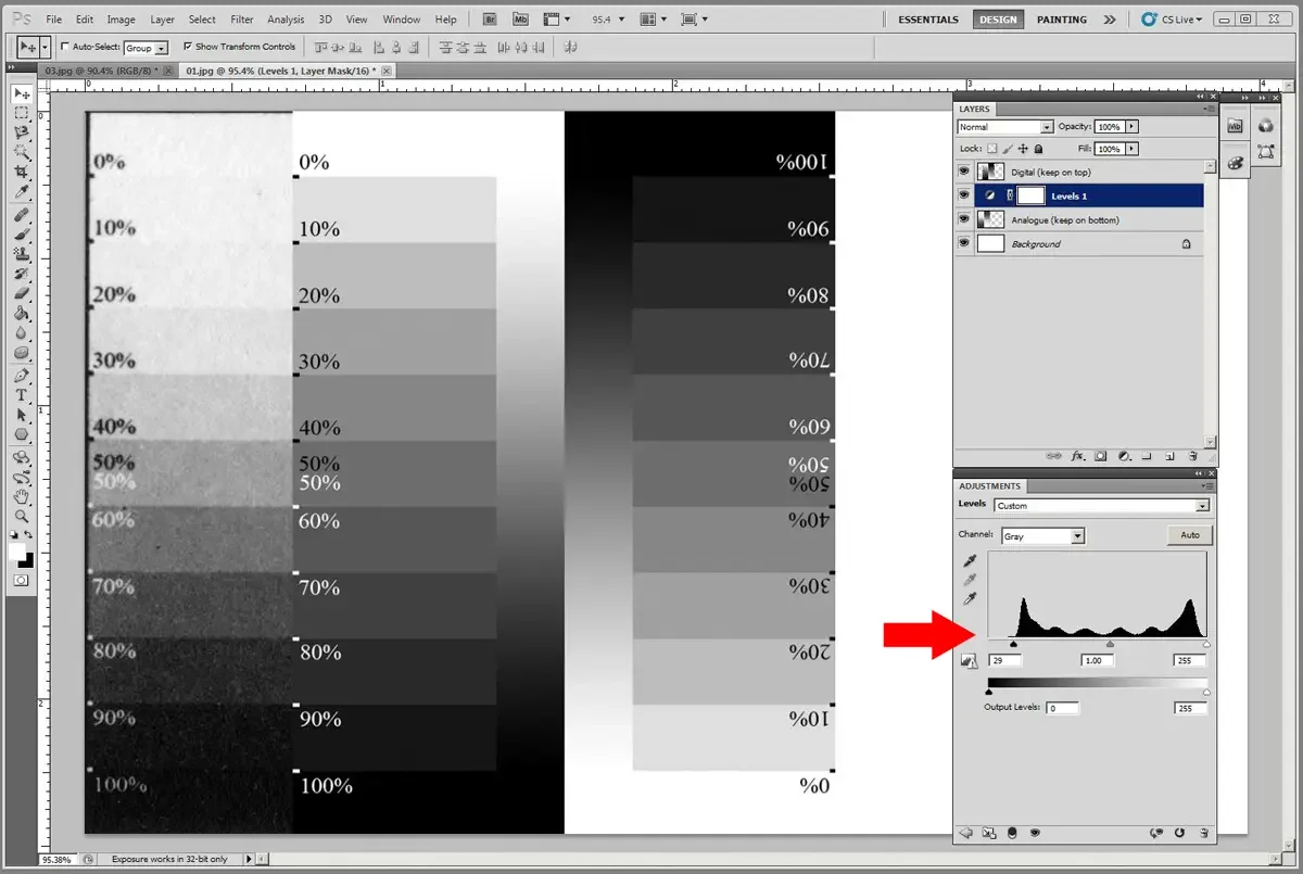
With the print layer active, use the rectangular marquee tool to select as much of a single gray box in the print as possible. Make sure that you only select within a specific density and do not inclue the numbers. The goal is to only have tone in the selection.
Once you have the selection click on Filter —> Blur —> Average.
Repeat this process on all boxes in the print step wedge.
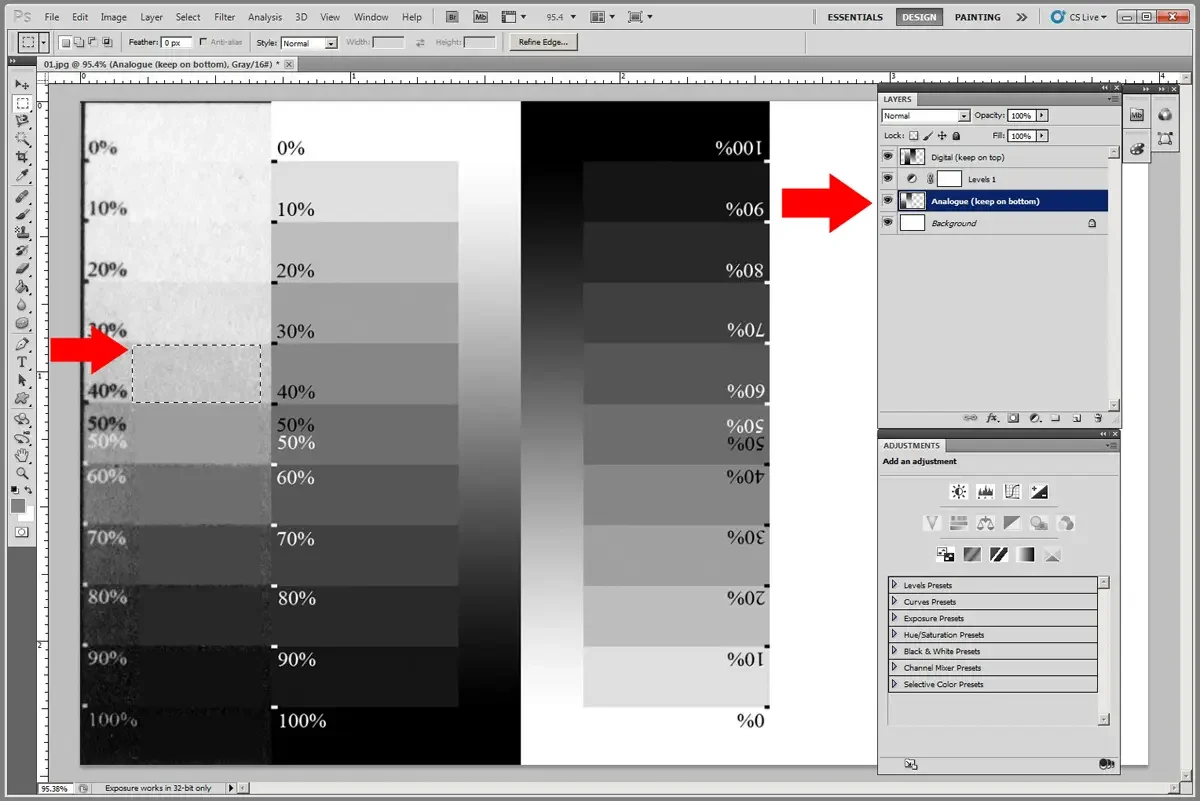
This process should make it easier to see the differences between the print and the digital file.
The closer you get to 0% and 100% densities, the more careful you will have to be with your selection. Sometimes the print has information loss in which 80% drops to 100% and 20% blows out to 0%. The curve being built here will help, but if there is that much clipping already, you may have to repeat the entire process once you have new prints made with this curve.
Here is where your eyes are important. If there is even a slight density difference, you need to capture it. For example, if the 80% box was reading 95%, then it’s useful information. Zoom in and look very carefully.
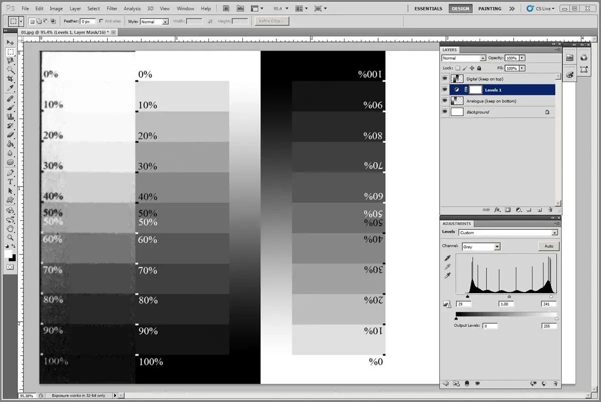
Zoom in so that you can see both the print and the digital image rectangles for 50% density.
Create a new Curves adjustment layer that rests between the print and digital image layers (above the print, below the digital).
This is the start of making the adjustment curve. The curve will be applied to the print while the digital stays the same, acting as our target.
Click on the center of the curve, trying to hit 50%.
With that active, use the arrow keys to bump the point around until Output and Input are both 50%. That is a neutral starting point.
In the curves adjustment layer, the vertical axis represents the density value (% black) that is input from the image or application. The horizontal axis represents the density value that is output. In this case, you must consider the output as what ends up happening in your final print. With so many steps from computer to final print, the output is not going to match the input.
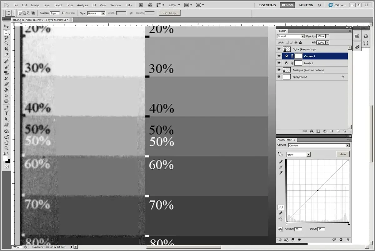
With the point plotted at Output:50/Input:50 active, use the the up/down arrow keys to change the 50% box in the print (left) until it matches the 50% box in the digital (right).
Only use the up/down arrow keys.
Using the left/right arrows will change something we don’t want to change (output).
In this example, Input was adjusted up to 74%.
It indicates that we need to request (input) 74% density from the transparency to yield (output) a 50% density result in our photogravure print.
The other boxes will change. That is ok for now. They will be addressed in later steps.
Get in the habit of writing down the results of the Input and Output windows. If you have data, you can reconstruct a curve (if you make a mistake or something gets lost). At this early stage, the only data we have is:
Output/Input
0/0
50/74
100/100
(to get a final output of 50% [print], we must input 74% [digital/transparency])
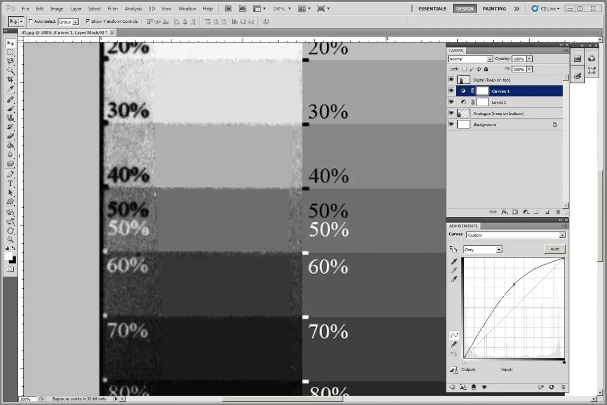
We had a good reading at 90% before we adjusted the 50% point. Let’s see if we can get 90% back to something normal.
Click on any point along the curved line near 90%.
With that point active, you can manually enter numbers into the Output/Input fields. Use that to manually enter 90% into the Input field.
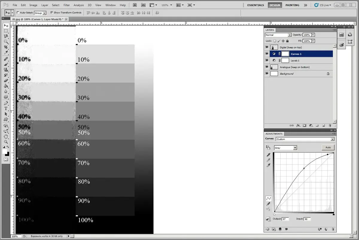
With the 90% point active, use the up/down arrow keys to move it along the vertical axis until the 90% box of your print matches the 90% box of the digital strip.
This fortuitous example yielded 90% as 90% (rare, but it does happen)
Write down the data for the curve you are building:
Output/Input
0/0
50/74
90/90
100/100
The horizontal axis is the Input axis. We are not moving that one

Go through the same process with 80, 70, 60; manipulating the plotted points with the up/down keys, attempting to match the tone of the print to the digital.
The curve will not look graceful, and you may discover one point that ends up being plotted lower than the next-lower neighbor. Every adjustment you make on the curve changes the overall curve, which is why the simple adjustments we are making don’t perfectly reflect the real math of these types of curves. It does work, however, becuase ultimately we are working with perceived light and dark values, filtered through our eyes to create relative impressions of light an dark.
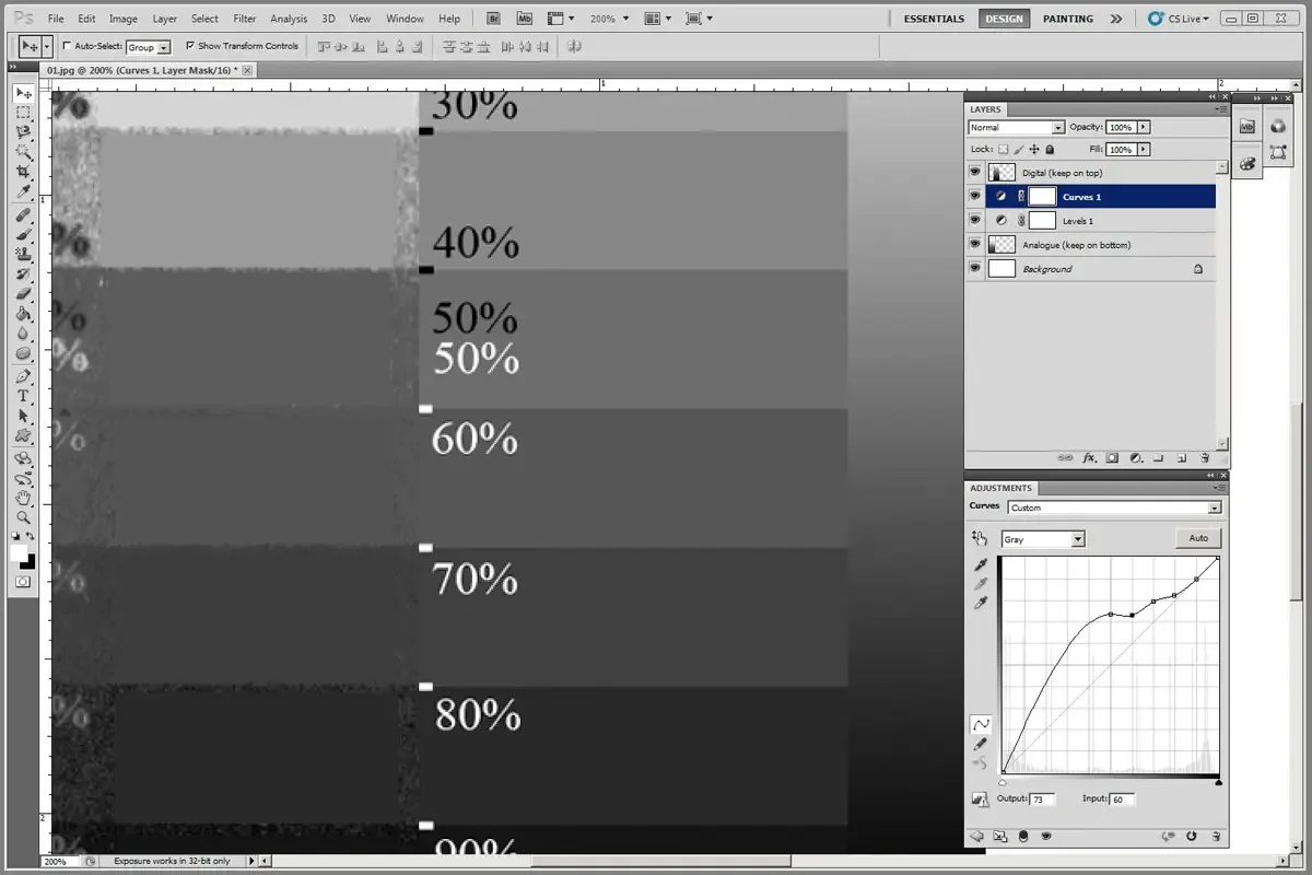
Keep working through points until you have plotted and adjusted as many as possible. Photoshop has a limit on the number of points you can plot. And, for practical purposes, we only need a few points. If you can plot 9 points, (10, 20, 30, 40, 50, 60, 70, 80, 90%) you have done enough work to make a powerful adjustment curve.
0% and 100% never move. That was already addressed with Levels.
The next step will fine-tune the curve to address any strange dips or reversals.
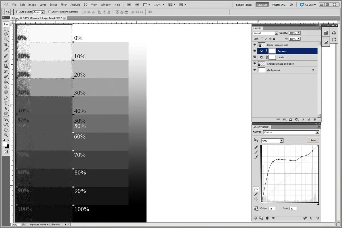
Reversals. The curve has an overall decending (or ascending) pattern. If you notice a point that stands out as lower or higher than its neighbors, click on it and bring it back in line (with up/down arrow keys) so the curve does not have a spike or a significant valley. Rely on what you see. Watch the image as you bump points around. The goal is to have the two step wedges (one from the print, the other digital) match.
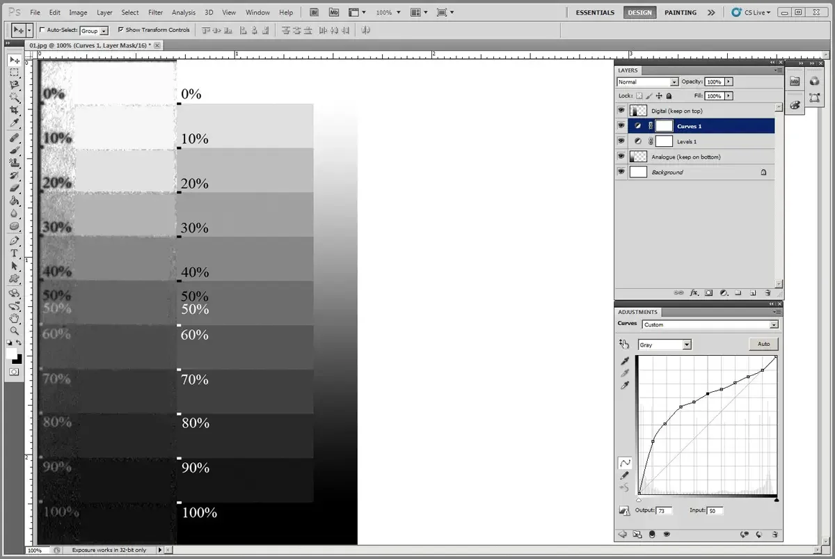
You could keep going, but at some point you have to stop and accept how close you got. I am usually happy if 0, 30, 50, 80, 100% are a good match and the rest of the steps between those numbers show a logical progression from light to dark (not all the same tone).
Here is the recorded data:
Output Input
0 0
5 40
10 43
20 52
30 57
40 63
50 69
60 75
70 79
80 82
90 90
100 100
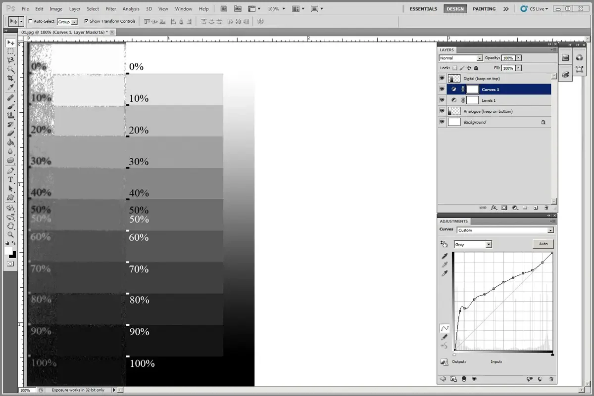
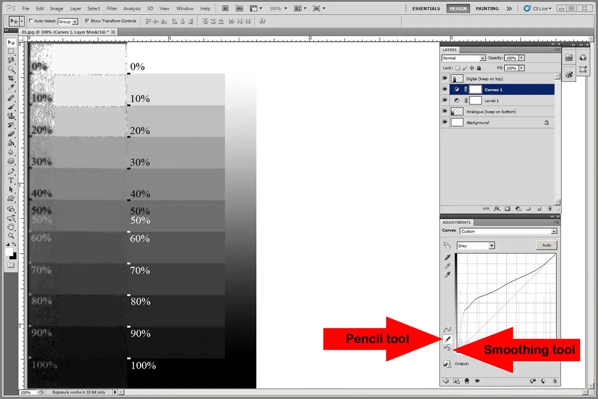
Sometimes smoothing is a useful option. Be careful not to over smooth.
In the lower left corner of the adjustment window, click on smoothing tool (below the pencil icon)
Use the tool to make the curve make sense, not to make it aesthetically pleasing.

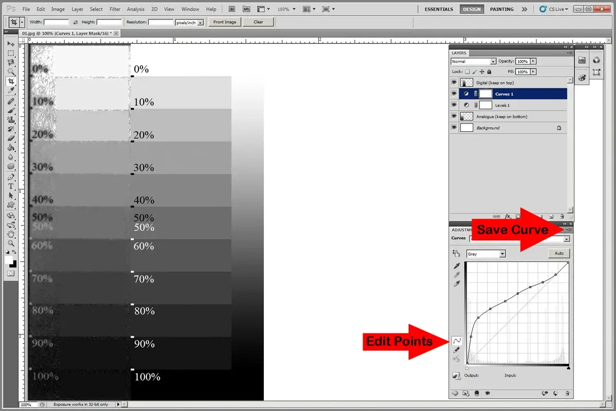
Save The Curve
From the hamburger menu, choose “Save Curves Preset”
Name the curve and save it with the .acv extension.
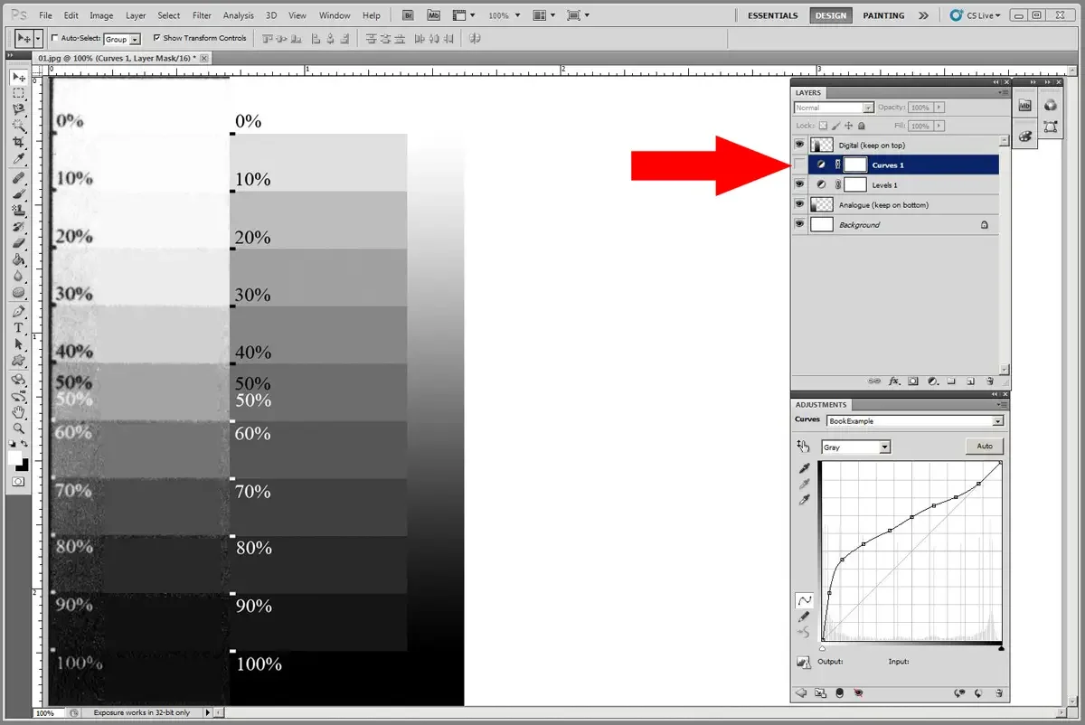
Click the curves layer off and on to see how much work you did and how close you got to making the print look like the digital.
Different Conditions Require Different Curves
Switching UV exposure units, changing exposure lengths, using a new print frame, buying a new printer, using a different brand of transparency, updating an operating system… too many variables exists to list them all. If you change one variable in your process, you may have to go through the process of making a new adjustment curve.
Like printing, the more you do this process the more skilled you become. You will also, like printing, start to develop some intuition about curves. But, it takes time. It is an iterative process.
Resources
The system shown above is one that I developed after gaining an understanding of some of the underlying principles of adjustment curves. I have not yet seen this simple method on the internet of in books that I have read. My hope is, that by showing different systems of finding adjustment curves, it will provide a contrast to all of the other methods and systems that are either in print or on the web.
Below you will find a list of resources that I have used with varying degrees of success. I encouarge you to follow some of the links and try some other systems so that you can gain a deeper understanding of how adjustment curves work. All the systems work. they all have the same basic principles, with different workflows that appeal to differen personalities.
https://www.quadtonerip.com/html/QTRoverview.html
https://www.amazon.com/Making-Digital-Negatives-Contact-Printing/dp/0964963868/?tag=scottparkerph-20
https://precisiondigitalnegatives.com/pages/about-precision-digital-negatives